Two chapters ago, we did a great job of creating linear regression models, which was the first time in this book that we created prediction models. With a lot of TLC, we created a y = mx + b (rhymed on purpose) so that whatever future of value of x we had, we could predict what y would be.
However, that was when we had numeric data. What happens when we do not have any numeric data? From our last chapter, we know that is where a chi-square comes in, but what if we want to still do some predicting? This is exactly where Logistic Regression comes into play.
NoteThe question we are trying to answer is:
Can we predict if someone will default on their credit cards based on other factors about them?
Could you have predicted that there would be another chapter about making predictions…?
Using the ISLR2 package, we will be working with the Default dataset.
9.2 Learning Objectives
By the end of this chapter, you will be able to:
Explain when logistic regression is appropriate and how it differs from linear regression
Interpret probabilities, odds, log-odds, and odds ratios in the context of binary outcomes
Perform exploratory data analysis for a binary response variable, including calculating proportions and odds
Visualize relationships between a binary outcome and predictor variables
Split data into training and testing sets for predictive modeling
Fit a logistic regression model using glm() with a binomial family
Interpret logistic regression coefficients and convert them to odds ratios using exp()
Assess model fit using McFadden’s pseudo-R²
Evaluate predictor importance and check for multicollinearity using VIF
Generate predicted probabilities and classifications from a fitted model
Evaluate classification performance using confusion matrices, sensitivity, specificity, and balanced accuracy
Assess model discrimination using ROC curves and the Area Under the Curve (AUC)
9.3 Load and Preview Data
First, we need to load the ISLR2 package and then we will create our cc_data dataset using the Default dataset, which inside the package.
library(ISLR2)library(tidyverse)cc_data <- Default # this data comes from the ISLR2 packagelibrary(skimr)skim(cc_data)
Table 9.1: The skim function provides us with insightsinto our data that are helpful when first looking at the data.
Data summary
Name
cc_data
Number of rows
10000
Number of columns
4
_______________________
Column type frequency:
factor
2
numeric
2
________________________
Group variables
None
Variable type: factor
skim_variable
n_missing
complete_rate
ordered
n_unique
top_counts
default
0
1
FALSE
2
No: 9667, Yes: 333
student
0
1
FALSE
2
No: 7056, Yes: 2944
Variable type: numeric
skim_variable
n_missing
complete_rate
mean
sd
p0
p25
p50
p75
p100
hist
balance
0
1
835.37
483.71
0.00
481.73
823.64
1166.31
2654.32
▆▇▅▁▁
income
0
1
33516.98
13336.64
771.97
21340.46
34552.64
43807.73
73554.23
▂▇▇▅▁
Our data contains 10,000 rows of data, each relating to a particular person. Two variables are factors, the other two are numeric. The variables are:
default: A factor with levels No and Yes indicating whether the customer defaulted on their debt
student: A factor with levels No and Yes indicating whether the customer is a student
balance: The average balance that the customer has remaining on their credit card after making their monthly payment
income: Income of customer
NoteRegarding the ISLR2 package:
The definitions of the columns come directly from the description found in the package
We have our most crucial data point - if the person did or did not default on their credit card payments. Soon, we will be using the other data points to see if we can predict if someone will or will not default on their payments.
First, let’s do a little digging to find out more about our data.
9.4 Exploratory Data Analysis
Before we predict if a person defaults or not, it is good to find out more about the default variable, answering some questions like:
How many people have defaulted?
What percentage of people have defaulted?
What are the odds that someone will default?
What are the preliminary relationships between default and the other variables?
Table 9.2
table(cc_data$default)
  No  Yes
9667  333
# Proportion of people who defaultp <-mean(cc_data$default =="Yes")p*100
[1] 3.33
odds <- p / (1- p)# Below provides us with the default ratecat("Default rate:", round(p*100,2), "%\n")
Default rate: 3.33 %
# Below provides us with the odds of someone defaultingcat("Odds of defaulting:", round(odds,4), "\n")
Odds of defaulting: 0.0344
# Below provides us with the odds ratiocat("Equivalent odds ratio (1 in every", round(1/odds,0), ")\n")
Equivalent odds ratio (1 in every 29 )
# Cross-tab between student status and defaultcc_data %>%count(default, student) %>%arrange(desc(n))
  default student    n
1      No      No 6850
2      No     Yes 2817
3     Yes      No  206
4     Yes     Yes  127
Table 9.3: A summarized table uncovering insights into the relationship between income and default.
# Quick descriptive statslibrary(mosaic)favstats(income ~ default, data = cc_data)
  default       min       Q1   median       Q3      max     mean       sd    n
1      No  771.9677 21405.06 34589.49 43823.76 73554.23 33566.17 13318.25 9667
2     Yes 9663.7882 19027.51 31515.34 43067.33 66466.46 32089.15 13804.22  333
  missing
1       0
2       0
Table 9.4: A summarized table uncovering insights into the relationship between balance and default.
favstats(balance ~ default, data = cc_data)
  default      min        Q1    median       Q3      max      mean       sd
1      No   0.0000  465.7146  802.8571 1128.249 2391.008  803.9438 456.4762
2     Yes 652.3971 1511.6110 1789.0934 1988.870 2654.323 1747.8217 341.2668
     n missing
1 9667       0
2  333       0
Some things that were uncovered in the code above:
The probability of someone defaulting is 0.0333.
The percentage of people defaulting is 3.33%.
Note: Probabilities are always going to be a number between 0 and 1. This is incredibly important later when we are trying to create our line.
1 in every 29 people will default on their credit card. These are the odds, which by definition, compare successes (defaults) to failures (non-defaults).
While probabilities are between 0 and 1, odds are between 0 and ∞.
An overwhelming majority of students did not default.
The mean income of people who do not default is only slightly higher than people who do.
The mean balance of people who do default is more than double the amount than people who don’t.
Overall, most people don’t default on their credit cards, and while we see differences in means, we do not know if the difference is statistically significant or not.
Now that we have some insights, it is time to visualize!
9.5 Visualize Relationships
We are going to make three different visualizations:
A bar plot of defaults
A histogram of balances split by default, and then
A scatterplot of balance and income
For fun, we will be utilizing some themes from the ggthemes package. When recreating these on your own, of course feel free to play around and change the themes. As I always say, R puts the r in Artist!
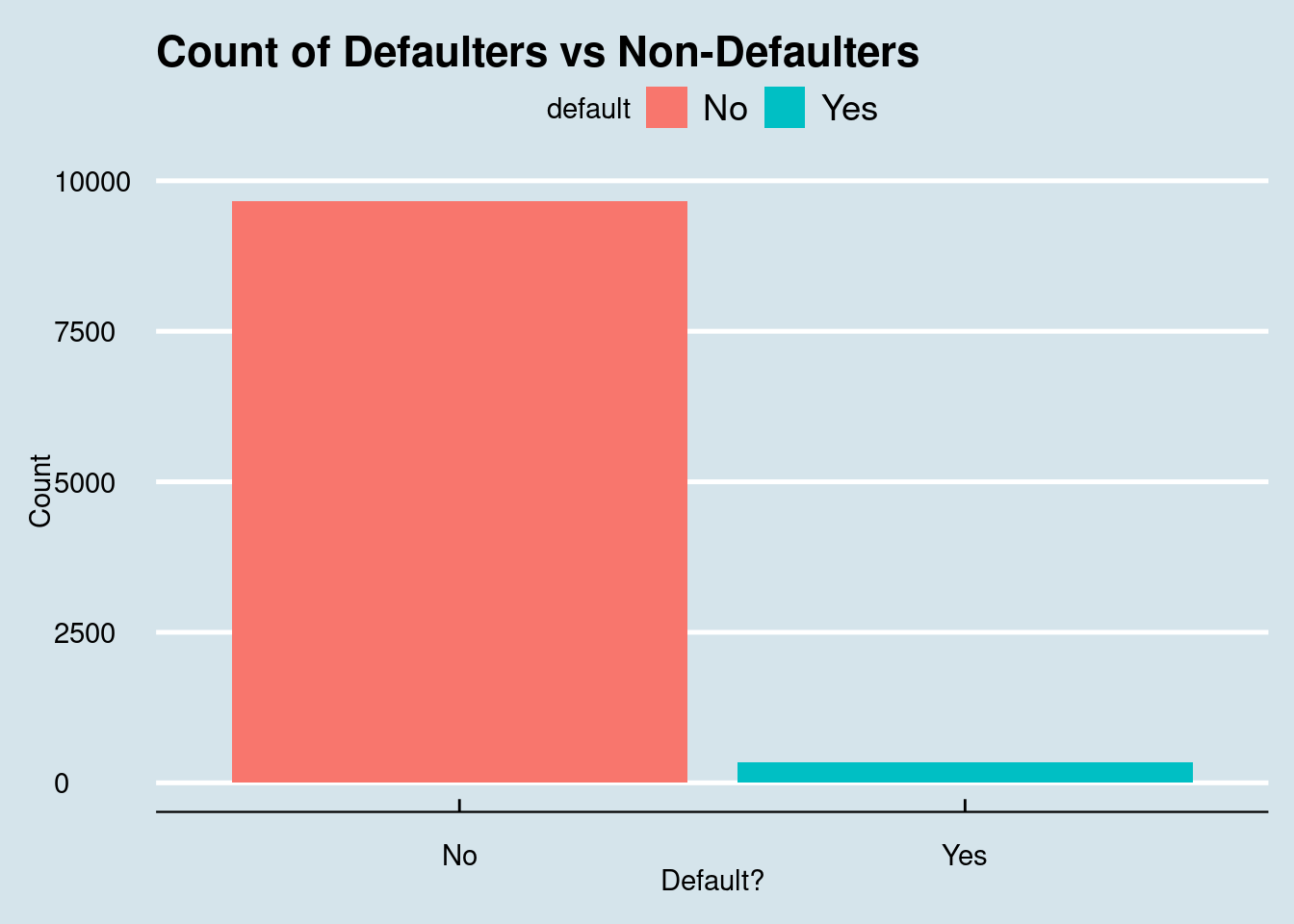
library(ggthemes)library(ggpubr)# Default distributionggplot(cc_data, aes(x = default, fill = default)) +geom_bar() +labs(title ="Count of Defaulters vs Non-Defaulters", y ="Count", x ="Default?") +theme_economist()
Figure 9.1: Most customers do not default on their credit cards, with defaulters representing only about 3% of the dataset.
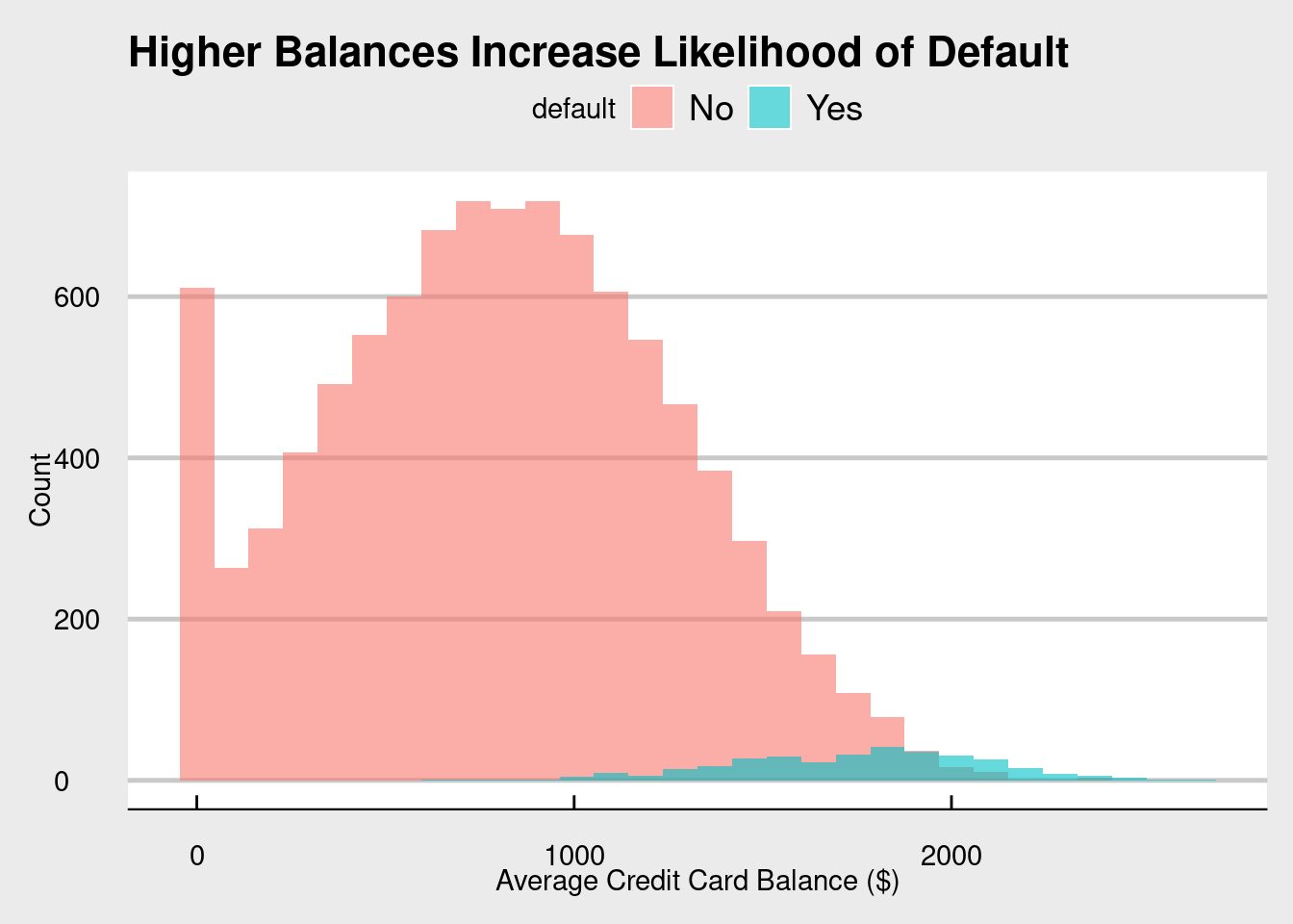
# Balance by defaultggplot(cc_data, aes(x = balance, fill = default)) +geom_histogram(position ="identity", alpha =0.6, bins =30) +labs(title ="Higher Balances Increase Likelihood of Default",x ="Average Credit Card Balance ($)", y ="Count") +theme_economist_white()
Figure 9.2: While most customers do not default on their credit cards, it seems that people that do have higher balances.
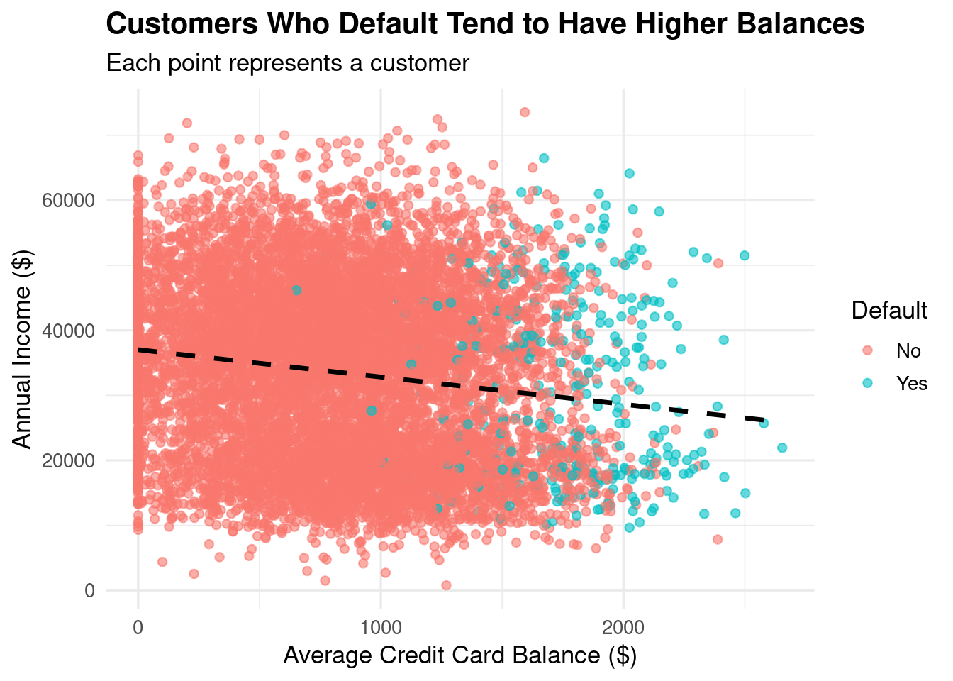
# Balance vs. Incomeggplot(cc_data, aes(x = balance, y = income, color = default)) +geom_point(alpha =0.6) +geom_smooth(method ="lm", se =FALSE, color ="black", linetype ="dashed") +labs(title ="Customers Who Default Tend to Have Higher Balances",subtitle ="Each point represents a customer",x ="Average Credit Card Balance ($)",y ="Annual Income ($)",color ="Default") +theme_minimal(base_size =13) +theme(plot.title =element_text(face ="bold"))
Figure 9.3: Regardless of if you default or not, there is a negative relationship between Annual Income and Average Credit Card Balance.
The visualizations look great! In terms of insights, we see (again) that most people do not default on their credit cards, most balances are around the 800 range for non-defaulters and higher for the defaulters, and that as balance increases, income decreases.
With a basic understanding of our data, it is now time to do something really fun - split our data!
9.6 Train and Test Split
Right now, we have one complete data set. What is amazing about our data is that it is complete. We have 10,000 data points each with the crucial information of if the person did or did not default. Our goal is still to create a model that takes the information we have about the people (if they’re a student, their balance, and their income) and use it to predict if a person will or will not default.
Ideally, we want this model to be able to predict it for people in the future? When we build it, how will we know how accurate it is?
In scenarios like this, we can actually split our data into two sets: one for training (creating our model) and one for testing (see how well our model actually works). This is important because we get to test our model using real data. It is kind of like practicing a basketball move before you use it in a real game.
Our goal: use a decent portion of our real data to test our model, and compare it to data not used in the model.
# set.seed allows us to get the same split of the data each time we run this codeset.seed(42)library(caTools) # Package that helps us split our data into Train and Test sets.# We are going to be doing a 70/30 split. It is good practice to have most of your data in the trainingsample <-sample.split(cc_data$default, SplitRatio =0.7)# This creates our test data, what we will use to train our logistic regression modeltraining_data <-subset(cc_data, sample ==TRUE)# This creates our test data, what we will measure our model againsttest_data <-subset(cc_data, sample ==FALSE)
We have successfully split our data into a training and a testing set! Again, most of our data is going to go into the training data set. We want our model to be as successful as possible while also providing enough of a chance to see if it works.
We have our training set, so let’s get predicting!
9.7 Build Logistic Regression Model
When building a logistic regression model, it is going to look very similar to the linear regression model we built starting in Section 8.7. The major difference from a coding perspective between a linear regression and a logistic regression model is that instead of using lm(), you need to use glm().
Before we create our model, let’s take a step back. Logistic regression, just like linear regression, is a tool to help us predict an outcome. Specifically, we are predicting the probability of an outcome.
NoteThe formula for the logistic regression is as follows:
where (p) is the probability of default. The left-hand side is called the logit, or log-odds. Notice that the right-hand side looks just like a straight-line regression.
In Linear Regression, your line goes on forever in both directions. But in probability, you can’t be less than 0% or more than 100%. If you used a straight line to predict defaults, the math might eventually say someone has a -20% chance of defaulting, which is impossible.
To fix this, we use the Sigmoid Function. This “squashes” the straight line into an S-curve that stays strictly between 0 and 1.
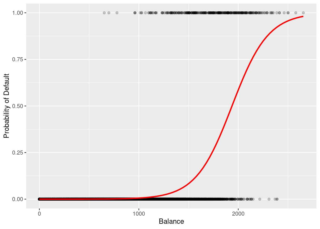
ggplot(cc_data, aes(x = balance, y =as.numeric(default) -1)) +geom_point(alpha =0.2) +geom_smooth(method ="glm", method.args =list(family ="binomial"), se =FALSE, color ="red") +labs(y ="Probability of Default", x ="Balance")
`geom_smooth()` using formula = 'y ~ x'
Figure 9.4: When plotting the balance and the default, the scatterplot creates a line that is not linear, but in fact an S shape.
In Figure 9.4, notice how the red line transitions from a low probability to a high probability as the balance increases. Unlike a straight linear line, this S-curve naturally ‘levels off’ at 0 and 1, ensuring our predictions remain realistic probabilities.
Now, let’s get to business and create our logistic regression model.
Table 9.5: Logistic Regression Model Predicting the Probability of Credit Default based on Student Status, Account Balance, and Income.
# We are using binomial as family since default is yes/notrain_model <-glm(default ~ student + balance + income,family ="binomial", data = training_data) summary(train_model)
Call:
glm(formula = default ~ student + balance + income, family = "binomial",
    data = training_data)

Coefficients:
              Estimate Std. Error z value Pr(>|z|)
(Intercept) -1.090e+01  5.931e-01 -18.372  < 2e-16 ***
studentYes  -8.245e-01  2.835e-01  -2.908  0.00364 **
balance      5.796e-03  2.805e-04  20.661  < 2e-16 ***
income       2.768e-06  9.736e-06   0.284  0.77614
---
Signif. codes:  0 '***' 0.001 '**' 0.01 '*' 0.05 '.' 0.1 ' ' 1

(Dispersion parameter for binomial family taken to be 1)

    Null deviance: 2043.8  on 6999  degrees of freedom
Residual deviance: 1098.2  on 6996  degrees of freedom
AIC: 1106.2

Number of Fisher Scoring iterations: 8
After we create our model and call summary(), we get an output that should look similar to the outputs we’ve seen before in this chapter. Taking a look at our wall of words, it is incredibly important to note that the numbers here represent the log-odds
Model interpretation:
Student (negative coefficient, not significant): Students less likely to default.
Balance (positive, significant): Higher balance = higher odds of default.
Income (tiny effect, not significant).
“Fisher Scoring iterations: 8” means R needed 8 rounds to find best fit.
One thing to note is that unlike a linear regression model, logistic regression models take a few tries to create the best model (in this case, 8).
While the outputs look the same, there is a major difference in the numbers that are output in a logistic regression vs a linear regression. Remember earlier when we calculated the probability of someone defaulting? It was mentioned that probabilities will always be a number between 0 and 1. But, when we are creating a line in a regression model, we can get any numbers between -∞ and ∞. How does logistic regression, which uses probabilities, make a line then?
Log-odds!
We need to get a number that actually has a range, and this is exactly where log-odds come in. Because with regression, we need to get a line (and to build a line, we need a formula). Instead of modeling probability, we model the log of the odds. Here is the step by step of how logistic regression works:
 (Intercept)   studentYes      balance       income
1.850225e-05 4.384379e-01 1.005813e+00 1.000003e+00
# Example: students have 0.43× the odds (≈57% lower odds) of defaulting
A very important thing to note is that odds and probability are not the same thing. With odds ratios, we are looking to see how much larger or smaller it is than 1.
OR = 1 → no change
OR > 1 → increase
OR < 1 → decrease
Breaking this down using our model:
If you are a student, the odds of you defaulting decrease, as the odds ratio is 0.438. Their odds are 56.2% lower than non-students (1 - 0.438). This is a significant difference.
For every dollar your balance increases, the odds of you defaulting increase by 0.58%. This seems small per dollar, but compounds rapidly across real-life balance amounts. For example, increasing the balance by $100 multiplies the odds of default by about 1.78, which is a 78% increase in odds.
The odds ratio for income is so small (OR = 1.000003), that a $1 increase in income has basically no influence on your default odds.
9.7.1 McFadden’s Pseudo-R²
Unlike in linear regression, logistic regression does not have an R²: (for a review on R²: see Section 8.7). However, we can use the pscl library to calculate a pseudo R² value.
              Overall
balance    20.6607703
studentYes  2.9080015
income      0.2843578
# balance seems to be the most impactful in our model
9.7.3 Multicollinearity check
Just like in Section 7.8, we want to check to see if there is any interactions between some of our variables that may be impacting our regression model. Using the vif function from the car library, we can see the interactions between our variables in our model.
# does not seem to be any multicollinearity# anything less than 5 means no multicollinearity
As of right now, it is safe to say that there is no multicollinearity, as all values are less than 5.
9.8 Make Predictions
Before, we took our data and split it into a training set and a test set. Using the training set, we built a logistic regression model. Now that we have it, it is time to test it against our test data!
As previously stated, it is best to test our model against real data, because we then get to compare and contrast what our model predicted vs what actually happened. It is now time to do exactly that!
We are going to create two new columns in our test data:
pred_prob: Our model is going to predict the likelihood of someone defaulting, using that row’s data.
pred_class: based on the probability from pred_prob, it is going to either be “Yes” or “No.”
In the above code, we used 0.5 as our cutoff for deciding if a person defaulted or not. 0.5 is a good measure since it is at the halfway point, but it is up to you to decide what the marker should be.
With this code complete, our model has now churned out the results (if someone will or will not default on their credit card).
9.9 Evaluate Model
Using real data (our test data) and a built logistic regression model, we now have predicted if a person will or will not default on their credit card. The next question is: how well did our model predict if someone defaulted on their credit card or not?
To do this, we run the command confusionMatrix. This comes from the caret package which we have already loaded.
Table 9.6: Confusion Matrix Evaluating Model Predictions Against Actual Default Status on the Test Dataset.
Confusion Matrix and Statistics

          Reference
Prediction   No  Yes
       No  2886   71
       Yes   14   29

               Accuracy : 0.9717
                 95% CI : (0.9651, 0.9773)
    No Information Rate : 0.9667
    P-Value [Acc > NIR] : 0.06743

                  Kappa : 0.3934

 Mcnemar's Test P-Value : 1.247e-09

            Sensitivity : 0.290000
            Specificity : 0.995172
         Pos Pred Value : 0.674419
         Neg Pred Value : 0.975989
             Prevalence : 0.033333
         Detection Rate : 0.009667
   Detection Prevalence : 0.014333
      Balanced Accuracy : 0.642586

       'Positive' Class : Yes
Another wall of data. The first thing we see if a table of Reference vs Prediction. This tells us our true/false negatives/positives. For instance, there were 14 false positives. Most of our data is accurate: 2886 true negatives (most of our data is negative - people do not default).
Next, we get some performance metrics. Here is an initial breakdown of what we see:
Accuracy ≈ how often model is correct overall.
The model is very accurate, at about 97%.
95% CI: Where the accuracy of our model most likely lies.
No Information Rate (NIR): If we just predicted “No” for each row, how accurate would we be.
This is not much different from the actual accuracy.
P-value [Acc > NIR]: Is our model statistically different than if we just put “No” for each.
The p-value is not statistically significant, meaning there is no difference between running our model or just predicting “No” for each person.
Sensitivity: how well it finds actual defaults.
Only 29% of actual defaulters are detected.
Specificity: how well it identifies non-defaulters.
It predicts non-defaulters at almost 100%.
High accuracy but low sensitivity means the model misses many rare defaults.
Balanced Accuracy is a better metric for imbalanced data.
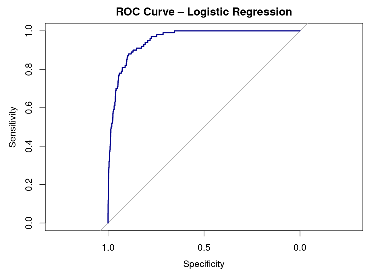
9.10 ROC Curve + AUC
As always, we want to visualize our data. To do this, we can create a special visualization, an ROC CURVE.
Receiver Operating Characteristic (ROC) curve for the logistic regression model predicting credit card default. The curve plots sensitivity against 1 − specificity across all possible classification thresholds. Curves closer to the top-left corner indicate better classification performance. The area under the curve (AUC) summarizes the model’s ability to distinguish between defaulters and non-defaulters.
auc(roc_obj)
Area under the curve: 0.9529
Interpretation:
ROC curve shows sensitivity vs. 1 - specificity.
AUC = 0.95 → excellent ability to distinguish defaulters from non-defaulters.
Random guessing = 0.5; perfect model = 1.0
9.11 Interpretation
Our logistic regression model predicts the probability that a person will default on their credit card based on balance, income, and student status.
Coefficients:
The model found a significant positive relationship between balance and default.
As balance increases, the odds of default rise sharply.
The student variable had a negative coefficient, meaning students are less likely
to default than non-students (about 57% lower odds, holding other factors constant).
Income showed a very small, non-significant effect once balance was included.
Model Fit:
McFadden’s R² ≈ 0.46, suggesting the model explains a moderate amount of variation.
The AUC = 0.95, indicating excellent ability to distinguish between defaulters and non-defaulters.
Confusion Matrix: high overall accuracy (~97%), but this is inflated due to the low number of defaults (class imbalance).
The model is excellent at identifying people who will not default, but less effective at catching rare defaults.
In short:
Balance is the strongest predictor.
Students are less likely to default.
Income doesn’t matter much here.
The model performs very well overall.
9.12 Key Takeaways
Logistic Regression predicts the probability of a categorical (binary) outcome.
Instead of fitting a straight line, it models the log-odds of the outcome.
Coefficients tell us how each variable changes the log-odds of the event.
Positive coefficients increase the odds; negative ones decrease them.
We exponentiate coefficients (exp()) to interpret them as odds ratios.
Example: An odds ratio of 1.50 means 50% higher odds of the outcome.
AUC (Area Under the Curve) tells how well the model separates the two groups:
Accuracy can be misleading when classes are imbalanced — check sensitivity and specificity instead.
ROC curves and confusion matrices help visualize model performance.
Logistic regression is a gateway to machine learning — it’s the foundation for classification models in predictive analytics.
9.13 Checklist
When running a logistic regression, have you:
9.14 Key Functions & Commands
The following functions and commands are introduced or reinforced in this chapter to support logistic regression modeling, classification, and model evaluation.
glm()(stats)
Fits generalized linear models, including logistic regression when using the binomial family.
summary()(base R)
Summarizes logistic regression output, including coefficients, standard errors, and p-values.
exp()(base R)
Converts log-odds coefficients into odds ratios for interpretation.
predict()(stats)
Generates predicted probabilities or classifications from a fitted logistic regression model.
sample.split()(caTools)
Splits data into training and testing sets for model validation.
confusionMatrix()(caret)
Evaluates classification performance using accuracy, sensitivity, specificity, and related metrics.
Assesses the relative importance of predictors in a classification model.
vif()(car)
Detects multicollinearity among predictors using variance inflation factors.
roc()(pROC)
Constructs a Receiver Operating Characteristic (ROC) curve to evaluate classification performance.
auc()(pROC)
Calculates the Area Under the ROC Curve (AUC) as a summary measure of model discrimination.
9.15 Example APA-style Write-up
The following example demonstrates one acceptable way to report the results of a logistic regression analysis in APA style.
Logistic Regression
A logistic regression analysis was conducted to examine whether credit card balance, income, and student status predicted the likelihood of default. The overall logistic regression model was statistically significant, \(\chi^2(3) = 428.52, p < .001\), and demonstrated good model fit, as indicated by McFadden’s pseudo-\(R^2 = .46\). Higher credit card balances were associated with increased odds of default, whereas students had significantly lower odds of default than non-students. Income was not a significant predictor after accounting for balance and student status.
9.16 💡 Reproducibility Tip:
When evaluating predictive models, results can change depending on how the data are split into training and testing sets. To make your results reproducible, always control randomness and clearly document your modeling choices.
Using set.seed() (like in the reproducibility tip found in Section 5.15) ensures that the same observations are assigned to the training and test sets each time the code is run. In addition, choices such as the train/test split ratio and classification threshold (e.g., 0.5) should be explicitly stated, as they directly affect model performance.
Predictive results are only reproducible when both the code and the evaluation decisions are transparent.