Table 8.1: Using the skim function provides us with insightsinto our data.
Data summary
Name
pizza_sales
Number of rows
156
Number of columns
3
_______________________
Column type frequency:
numeric
3
________________________
Group variables
None
Variable type: numeric
skim_variable
n_missing
complete_rate
mean
sd
p0
p25
p50
p75
p100
hist
Week
0
1
78.50
45.18
1.00
39.75
78.50
117.25
156.00
▇▇▇▇▇
Total Volume
0
1
88023.50
22863.94
55031.00
74347.00
83889.00
95113.00
227177.00
▇▃▁▁▁
Total Price
0
1
2.66
0.13
2.31
2.58
2.67
2.75
2.96
▁▃▇▆▂
8.4 Cleaning Our Data
In Section 7.3 we had to clean our data because of the spaces in the column headers. Our current data has the same issue, as “Total Volume” and “Total Price” both have a space in them. Looks like the clean_names() command will come in handy again like in Section 7.3. Let’s also do some other cleaning while we are at it.
library(janitor)# Let's get rid of any spaces in the column namespizza_sales<-clean_names(pizza_sales)# We just want to see the relationship between volume and price, so week does not matterpizza_sales<- pizza_sales %>%select(-1)# Let's rename our column names to make things easierpizza_sales <- pizza_sales %>%rename(price = total_price, volume = total_volume)
We now have a cleaner dataset we can use!
8.5 Visualizing Relationships
As emphasized in every chapter, it is imperative that we first graph our data to see what it looks like before we run any statistical analyses. Visuals really help us understand our data. Is our data linear? Can we see any patterns? Let’s find out!
For regression models, we use scatterplots. For a scatterplot, all we need are two numerical variables.
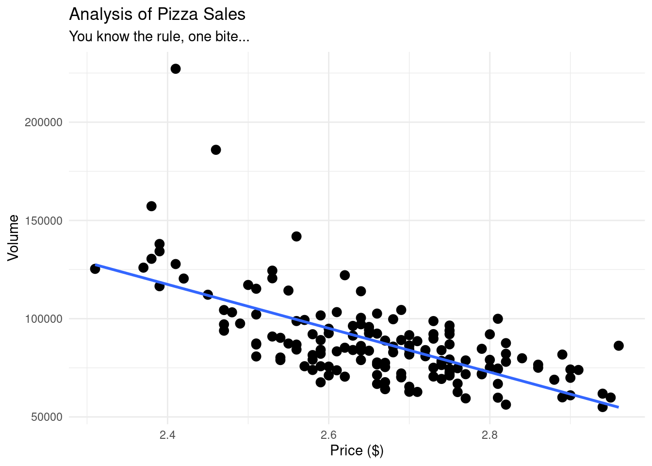
# Now, let us graph our data using ggplot# As always with ggplot, we have our data, our aesthetics, and our geometry.pizza_plot <-ggplot(pizza_sales, aes(x = price, y = volume)) +geom_point(size =3) +geom_smooth(method ="lm", se =FALSE) +# this adds a "line of best fit"theme_minimal() +labs(title ="Analysis of Pizza Sales",subtitle ="You know the rule, one bite...",x ="Price ($)", y ="Volume" )pizza_plot
Figure 8.1: Scatterplot showing the relationship between pizza price and weekly sales volume, with a fitted linear trend line. The downward slope indicates a negative linear association, suggesting that higher prices are associated with lower sales volume. This visualization is used to assess linearity and motivate the use of correlation and linear regression.
If we wanted to use another package instead of ggplot, we could also use the library ggformula.
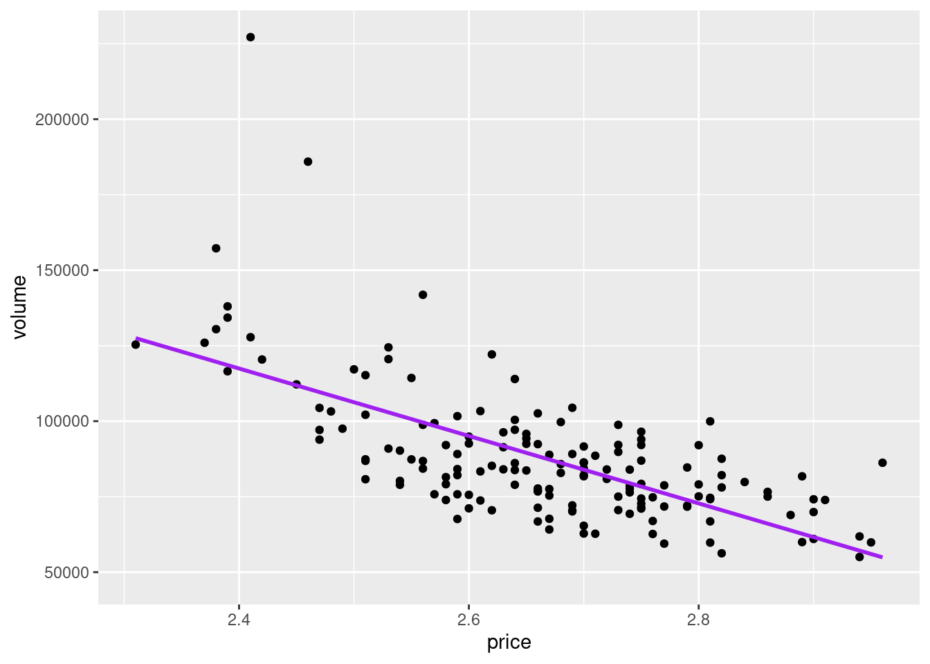
library(ggformula)pizza_plot_ggformula <-gf_point(volume ~ price, data = pizza_sales) %>%gf_lm(color ="purple")pizza_plot_ggformula
Figure 8.2: Scatterplot of pizza price and weekly sales volume created using the ggformula package, with a fitted linear regression line. This plot conveys the same information as the ggplot version, demonstrating that different visualization frameworks can be used to explore linear relationships.
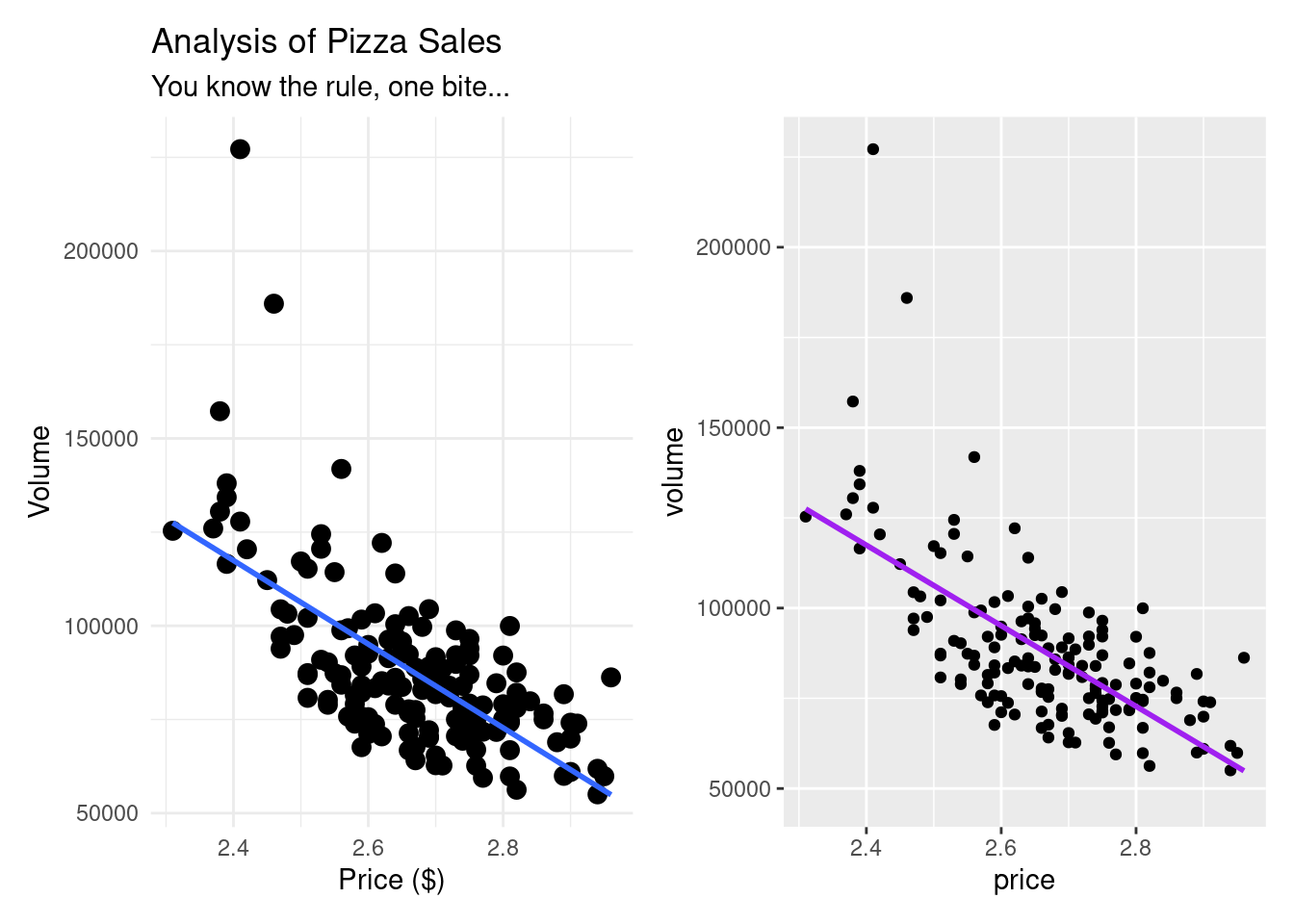
Here is a side by side comparison of what they look like. Very similar indeed.
Figure 8.3: Side-by-side comparison of scatterplots generated using ggplot2 and ggformula. Both visualizations display the same negative linear relationship between pizza price and sales volume, illustrating that different plotting systems can yield equivalent analytical insights.
Our data is already telling us a lot. From both of our graphics, we can see that as price is going up, volume is going down, indicating a negative correlation. Our line also seems pretty straight, indicating what seems to be a moderately strong correlation.
8.6 Understanding Correlation
Before we get to a linear regression, it is best to first understand how (if at all) our variables are correlated with each other. For a review on correlation, go back to chapter ?sec-cor.
We are first trying to figure out what variables, if any, should be included in our linear regression model, and this is exactly where correlation comes into play.
cor.test(pizza_sales$volume,pizza_sales$price)
    Pearson's product-moment correlation

data:  pizza_sales$volume and pizza_sales$price
t = -10.8, df = 154, p-value < 2.2e-16
alternative hypothesis: true correlation is not equal to 0
95 percent confidence interval:
 -0.7375315 -0.5567684
sample estimates:
       cor
-0.6564736
When we run a correlation, we are looking for three things:
The direction: is a positive or negative interaction?
The strength: how close is it to -1, 0, 1?
The p-value: Is it statistically significant?
The code above answers all three questions:
The direction: is negative.
The strength: about −0.66, indicating a moderately strong negative correlation.
The p-value: < 0.05 indicates that the relationship between price and volume is unlikely due to chance.
With a correlation coefficient of -0.66, we have a moderately strong negative correlation between price and volume. As price goes up, volume goes down - just what we saw in our graphs!
8.7 Linear Regression Model
We have identified that there is a significant negative correlation between the two variables. Since we want to be able to predict the amount (volume) of pizza sold using price, our next step is to run a linear regression model.
With a linear regression model, we are trying to build the line of best fit and figure out the equation for the line.
NoteThe formula for a line is:
y = mx + b
Where:
y is the predicted value (in this case, volume)
m is the slope
x is the given value (in this case, price)
b is the y intercept (the y value when x is 0)
When we are able to get the slope and the intercept, we can then begin to predict values.
To run a linear regression model, we can use the lm command. It follows the structure:
lm(y ~ x, data = dataset)
lm(what we want to predict ~ the predictor, data = our dataset)
Table 8.2: Linear Regression Model Predicting Pizza Sales Volume by Price
pizza_lm <-lm(volume ~ price, data = pizza_sales)# The code above is saving our linear regression model as pizza_lmsummary(pizza_lm)
Call:
lm(formula = volume ~ price, data = pizza_sales)

Residuals:
   Min     1Q Median     3Q    Max
-28602 -11685  -1824   8379 110857

Coefficients:
            Estimate Std. Error t value Pr(>|t|)
(Intercept)   385442      27575   13.98   <2e-16 ***
price        -111669      10340  -10.80   <2e-16 ***
---
Signif. codes:  0 '***' 0.001 '**' 0.01 '*' 0.05 '.' 0.1 ' ' 1

Residual standard error: 17300 on 154 degrees of freedom
Multiple R-squared:  0.431, Adjusted R-squared:  0.4273
F-statistic: 116.6 on 1 and 154 DF,  p-value: < 2.2e-16
# When we call summary on our model, we can find out our key insights
Congratulations! We have just run our first linear regression model! We have some key insights, including:
Intercept: 385,442. This is our b value on our line equation. This means that when the price of pizza is 0 (free pizza would be nice, but really just a dream), the y value would be 385442.
price: -111,669. This is our slope, or our m value on our line equation. This tells us that for every one-unit increase in price, sales volume decreased by approximately 111,669 units. This makes sense, since we have a negative correlation.
Multiple R-squared: As we have seen before, this tells us how much of the variability our model explains. For our example, about 43% of the variance in pizza sales volume is explained by price alone. Warning: Multiple R-squared in linear regression models always increases with each new predictor added to a model, regardless of how potent it is.
Adjusted R-squared: This is almost identical to the Multiple R-squared value, except that it takes into account each new predictor added, and does not go up just because a new predictor was added to the model.
p-value: There are three p-values here. The first two, on the intercept and price lines, indicate if the relationships are statistically significant, which they are. The bottom one is if the model itself is significant, which it is.
F-statistic: This tells us how strong our model is. 116.6 is a high value.
NotePutting this all together, our line formula is:
y = -111,669x + 385,442
All of these insights together mean that this is a very good model to predict volume of pizza sold.
In R, we always want to explore different packages. The broom package in R is very helpful when making statistical objects into nicer tibbles.
Table 8.3: Using the tidy function from the broom package to see the linear regression output.
# If we want to get the same information from our lm model using a different packagelibrary(broom)tidy(pizza_lm)
Our finalized equation is y (-111,669 * price) + 385,442. All we need to do is plug in any price value, and we can predict the volume of pizza sold.
8.8 Checking the residuals
TipTo make sure that our data for the line looks good, it is important to answer the question:
How close are our predicted values to our actual values?
To answer this question, we need to figure out the predicted values and then their residuals (the difference between the actual vs the predicted value).
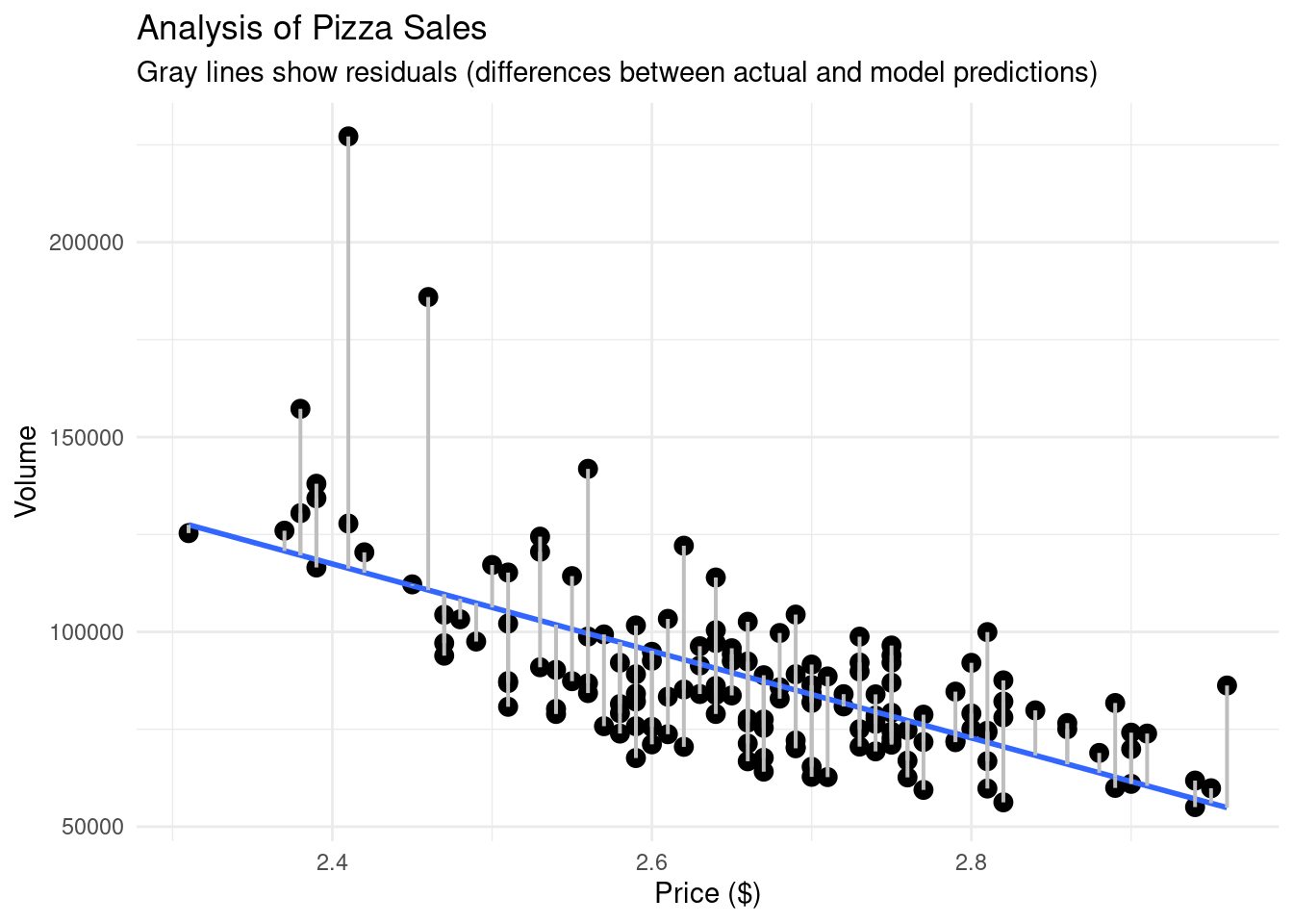
To visually see the difference between the actual values and the predicted values, we can create a similar scatterplot as before, but add lines connecting our line of best fit and our points.
# What if we want to see actual vs predicted on our plot?pizza_plot_residuals <-ggplot(pizza_sales, aes(x = price, y = volume)) +geom_point(size =3) +geom_smooth(method ="lm", se =FALSE) +geom_segment(aes(xend = price, yend = predicted), color ="gray", linewidth =0.7) +theme_minimal() +labs(title ="Analysis of Pizza Sales",subtitle ="Gray lines show residuals (differences between actual and model predictions)",x ="Price ($)", y ="Volume" )pizza_plot_residuals
`geom_smooth()` using formula = 'y ~ x'
Scatterplot of pizza price and sales volume with residual lines connecting observed values to model predictions. Each gray line represents a residual, illustrating the difference between actual sales and values predicted by the linear regression model.
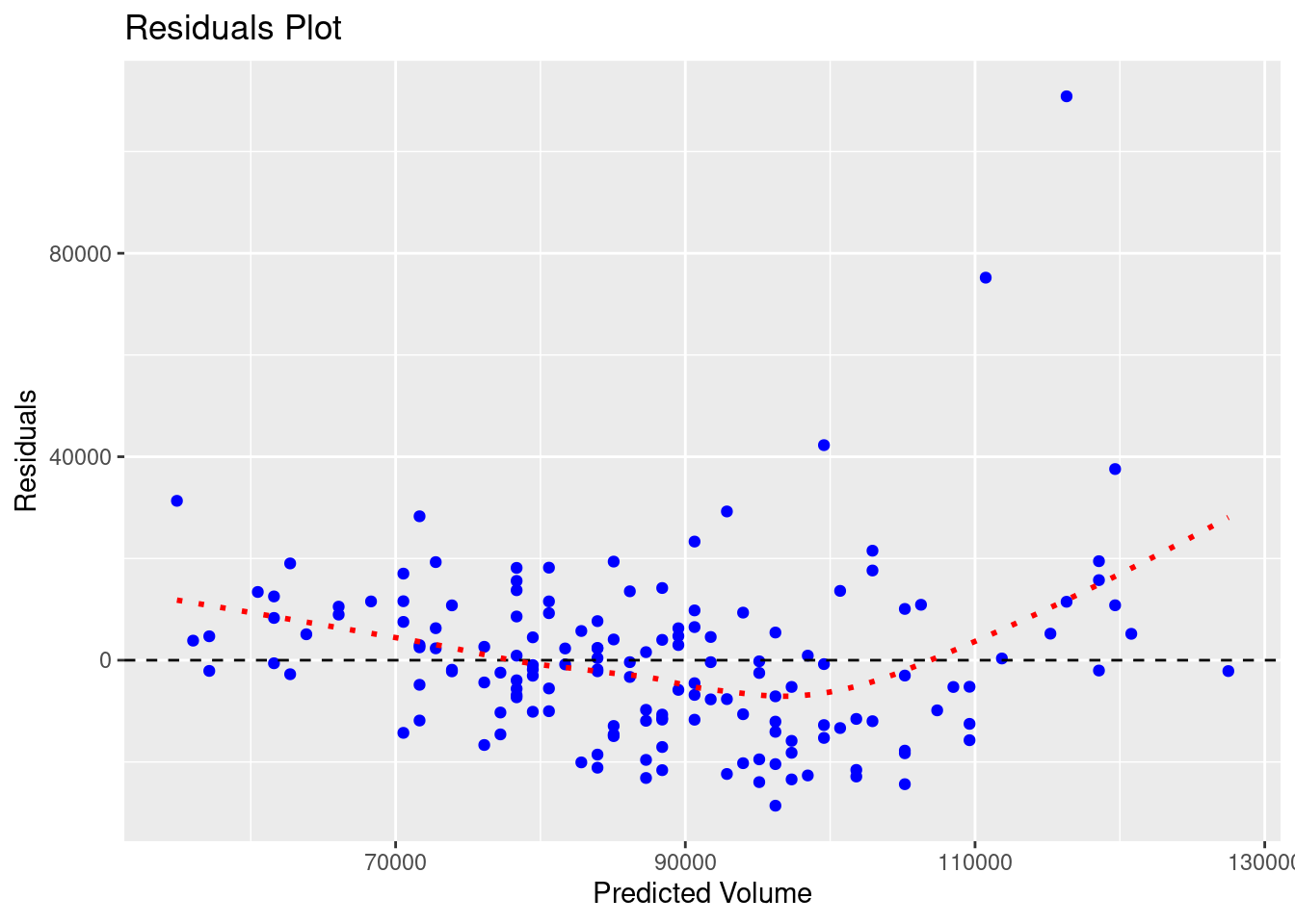
With our residuals, we want them to be random. Visually, that means that the residual values should be scattered on an x-y plane without a pattern. To see this, we can graph the residuals themselves.
# Let us graph our residuals to make sure they are randomggplot(pizza_sales, aes(x = predicted, y = residuals)) +geom_point(color ="blue") +geom_hline(yintercept =0, linetype ="dashed") +geom_smooth(se =FALSE, color ="red", linetype ="dotted")+labs(title ="Residuals Plot",x ="Predicted Volume",y ="Residuals" )
`geom_smooth()` using method = 'loess' and formula = 'y ~ x'
Residuals plotted against predicted sales volume from the linear regression model. Random scatter around the horizontal zero line indicates homoscedasticity, while systematic patterns would suggest violations of regression assumptions.
The red line in the graph above has a slight curve, showing that our model is less accurate at the extremes (low and high prices). Thankfully, this pattern isn’t very pronounced.
TipTo accompany the visual, we want to statistically test for heteroscedasticity, meaning:
Are the residuals roughly equal in variance across all predicted values?
We will either see:
Homoscedasticity: residuals are equally spread (good)
Heteroscedasticity: residuals get wider or narrower as predictions change (bad)
The Breusch-Pagan test provides insights for this.
Table 8.5: Breusch-Pagan output for the linear regression model.
library(lmtest)bptest(pizza_lm)
    studentized Breusch-Pagan test

data:  pizza_lm
BP = 7.7392, df = 1, p-value = 0.005403
The main focus point here is the p-value:
0.05 Fail to reject H₀ → residuals are homoscedastic (good)
< 0.05 Reject H₀ → residuals are heteroscedastic (not ideal)
Since our p-value is less than .05, our residuals are heteroscedastic.
This does not invalidate our model, and for right now, we do not need to change it. It is just showing us that it is not perfect, and not all prices predict equally well. In reality, this might happen if higher-priced pizzas are sold less frequently, giving us fewer data points and more variability.
Congratulations, we have just completed our first linear regression model!
8.9 Adding more variables
Throughout this chapter, we have only looked at 2 variables: price and volume to see if the former can predict the latter. But, what if we have more variables? Can we also utilize them in our regression model?
Let’s find out!
Let us create two new variables to add to our data: one where David Portnoy visited the pizza shop and another on how much was spent on advertising.
# Now, let's add some other variables to our dataset.seed(42)# 1) Dave Portnoy visit.pizza_sales <- pizza_sales %>%mutate(portnoy_visit =rbinom(n(), size =1, prob =0.06)) # about 3–6% of weeks# 2) Ad spendpizza_sales <- pizza_sales %>%mutate(ad_spend =round(runif(n(), 800, 6000), 0))
Now, since we have multiple variables, we can run what’s called multivariate regression model. To add more predictors, we simply use the + sign in our lm command after our first predictor.
m1 <-lm(volume ~ price, data = pizza_sales) # baselinem2 <-lm(volume ~ price + portnoy_visit, data = pizza_sales) # add portnoy visitm3 <-lm(volume ~ price + ad_spend, data = pizza_sales) # add ad spendingm4 <-lm(volume ~ price + ad_spend + portnoy_visit, data = pizza_sales) # both
Boom! In the code above, we have now run 4 regression models, with every combination included.
Now, we can run the summary or glance command on each model individually, compare the models manually, but that would require a lot of working memory power on our end. Or we could utilize some commands in R to make our lives much easier.
Table 8.6: A table of all of the AIC values for each of the linear regression models.
# How do we know which model is the best?library(AICcmodavg)AIC(m1, m2, m3, m4) %>%arrange(AIC)
# This code provides us with an AIC (Akaike Information Criterion) value.# The smaller the AIC, the better the model’s trade-off between complexity and fit.
Table 8.7: Comparison of Model Fit Indices across Four Linear Regression Models.
# Let's say we want to use the broom function again to do a model comparisonmodels <-list(m1, m2, m3, m4)# In the code above, we are taking all of our models and putting them into a "list" of modelsnames(models) <-c("m1","m2","m3","m4")# In the code above, we are just giving each item in the list a name# In the code below, we are saying "Hey, run glance on every single item on the models list and create a data framemap_df(models, ~glance(.x), .id ="model") %>%select(model, r.squared,adj.r.squared,p.value,AIC)
R²: A higher R squared means the model is a better predictor. Remember, R^2 always goes up with each added predictor, no matter how salient they actually are.
Adjusted R²: A higher adjusted R squared means the model is a better predictor. Adjusted R² always takes into account the number of predictors and does not inherently increase with more predictors.
p-value: If these models are statistically significant.
AIC: tells us how good our models are. A lower number means a better model.
Overall, the goal is to create the most parsimonious regression model as possible. That is, the model with the fewest necessary predictors. As such, the model that is most parsimonious is m1, the model with just price. Yes, other models have higher adjusted R^2 values and lower AIC numbers, but only slightly. In this case, m1 is the model to go with.
8.9.1 Bonus code
If you are looking to compare multiple regression models in a faster way, you could also utilize the code below.
full_model <-lm(volume ~ price + ad_spend + portnoy_visit, data = pizza_sales)step_model <-step(full_model, direction ="both")
Congratulations! You have successfully run correlations (to help see what variables we want to build our regression model with), regression models, multiple regression models, compared models, and even analyzed the differences between our actual values and our predicted values.
Don’t underestimate how powerful regression models can be. With a line equation, you can help predict any variable!
8.11 Key Takeaways
Linear regression helps us predict one variable (Y) from another (X) using a line of best fit.
The equation of the line is y = mx + b, where:
m = slope (how much Y changes for every 1-unit change in X)
b = intercept (the value of Y when X = 0)
The slope tells us both the direction and strength of the relationship.
Residuals = actual - predicted values; smaller residuals = better model fit.
A good model has random, evenly scattered residuals (homoscedasticity).
R² tells us how much variance in Y is explained by X.
Adjusted R² penalizes unnecessary predictors in multiple regression models.
AIC helps compare models: lower AIC = better balance between fit and simplicity.
Parsimonious models (simpler ones that still explain the data well) are preferred.
Stepwise regression automatically selects the most parsimonious model using AIC.
Correlation shows association; regression goes further by predicting and quantifying impact.
Always visualize both your model fit and your residuals before interpreting results!
8.12 Checklist
When running linear regressions, have you:
8.13 Key Functions & Commands
The following functions and commands are introduced or reinforced in this chapter to support linear regression modeling, diagnostics, and model selection.
lm()(stats)
Fits linear and multiple linear regression models using a formula interface.
summary()(base R)
Summarizes regression model results, including coefficients, R², F-statistic, and p-values.
cor.test()(stats)
Computes and tests correlations to assess whether predictors are suitable for regression.
predict()(stats)
Generates predicted values from a fitted regression model.
residuals()(stats)
Extracts residuals (actual − predicted values) from a regression model.
tidy()(broom)
Converts regression coefficients into a clean, tidy data frame.
glance()(broom)
Extracts model-level statistics (e.g., R², adjusted R², AIC) into a single-row summary.
bptest()(lmtest)
Performs the Breusch–Pagan test to assess heteroscedasticity of residuals.
AIC()(stats)
Compares regression models using Akaike Information Criterion to balance fit and complexity.
step()(stats)
Performs stepwise model selection to identify a parsimonious regression model.
8.14 Example APA-style Write-up
The following example demonstrates one acceptable way to report the results of a simple linear regression in APA style.
Simple Linear Regression
A simple linear regression was conducted to examine whether pizza price predicted weekly pizza sales volume. The overall regression model was statistically significant, \(F(1, 148) = 116.60, p < .001\), and explained approximately 43% of the variance in pizza sales volume (\(R^2 = .43\)).
Pizza price was a significant negative predictor of sales volume, \(b = -111,669\), \(SE = 10,347\), \(t = -10.80\), \(p < .001\), indicating that higher pizza prices were associated with lower weekly sales volume. Specifically, for each one-unit increase in pizza price, weekly pizza sales decreased by approximately 111,669 units.
8.15 💡 Reproducibility Tip:
Linear regression models involve many analytic choices, including which variables to include, how to assess relationships, and how to evaluate model fit. To support reproducibility, make each of these decisions explicit and evidence-based.
Before fitting a model, visualize relationships and examine correlations to justify why predictors are included. After fitting the model, report diagnostics—such as residual plots and measures of fit—to demonstrate that assumptions were checked.
WarningRemember:
Adding more variables does not always lead to a better model.
Regression results are only reproducible when both the code and the reasoning behind the model are transparent.