Whoever said a picture is worth 1,000 words severely understated how many words a picture is actually worth. When working with data, there is a strong argument to make that nothing is more important than visuals.
TipIf there is one piece of advice to take from this textbook, it is this:
After running summary statistics, always visualize your data!
You may be thinking “how powerful can a visualization even be?” That is a great question, that Anscombe’s quartet will help answer.
Quick history lesson. In 1973 (before the invention of R), a statistician named Francis Anscombe created four unique datasets, which all had identical summary statistics.
library(tidyverse)library(quartets)library(knitr)anscombe_quartet %>%group_by(dataset) %>%summarise(mean_x =mean(x),variance_x =var(x),mean_y =mean(y),variance_y =var(y),correlation =cor(x, y)) %>%kable(digits =2,caption ="A breakdown of summary statistics from the four individual datasets Anscombe created.")
Table 3.1: A breakdown of summary statistics from the four individual datasets Anscombe created.
dataset
mean_x
variance_x
mean_y
variance_y
correlation
(1) Linear
9
11
7.5
4.13
0.82
(2) Nonlinear
9
11
7.5
4.13
0.82
(3) Outlier
9
11
7.5
4.12
0.82
(4) Leverage
9
11
7.5
4.12
0.82
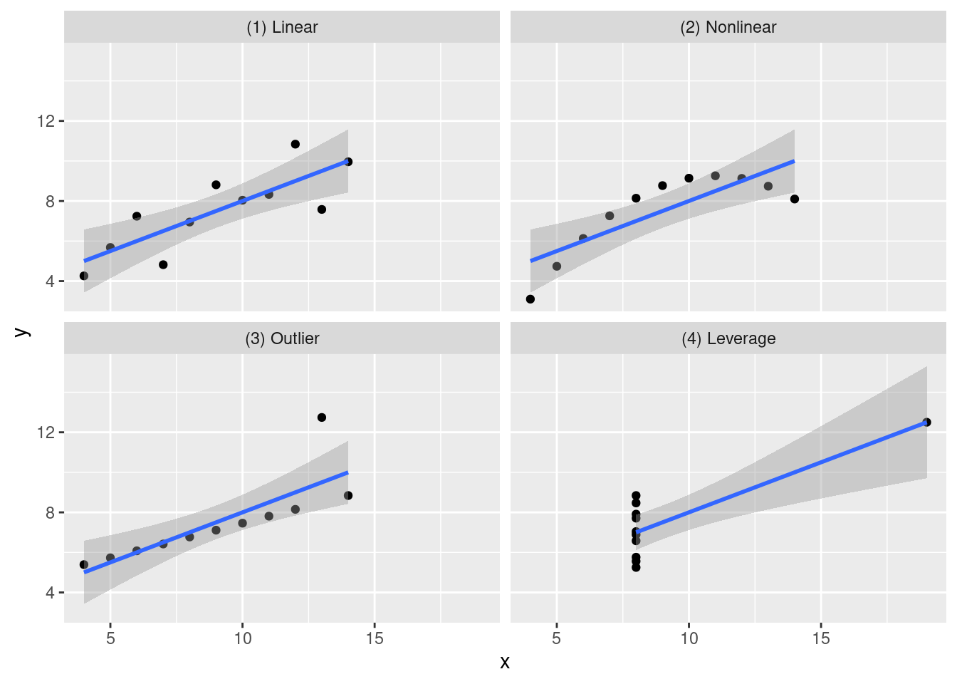
As Table 3.1 shows, all four of the different datasets show the same means, variances, and correlations (more on that in chapter 6). With just these summary statistics, you’d likely think “eh, all the data is the same, these datasets are basically identical.”
Wrong.
When we graph these four datasets, we see something totally different than what the table shows.
Figure 3.1: While the four datasets looked identical in the table, the visualized Anscombe datasets show an entirely different picture.
With our visualization, we are introduced to an entirely different way of seeing our data. The table showed that the summary statistics were identical, but here we can see:
Dataset One has a linear relationship between x and y.
Dataset Two has a nonlinear relationship between x and y.
Dataset Three, while still linear, has an outlier.
Dataset Four shows something totally different from the rest!
Visualizations provide insights into data that sometimes numbers can’t show.
This chapter is meant less to be a lesson, and more to be a reference page to come to when you need to make graphs. You do not need to remember every plotting option shown here. This chapter is designed to be returned to whenever you need a reminder or example.
3.2 Learning Objectives
By the end of this chapter, you will be able to:
Explain why visualizing data is a critical step alongside summary statistics
Describe the core grammar of graphics used by ggplot2 (data, aesthetics, geometry)
Create common plot types using ggplot2, including scatterplots, bar charts, column charts, histograms, density plots, boxplots, and line graphs
Map and customize aesthetics such as color, shape, size, fill, and transparency
Enhance visual clarity using labels, themes, facets, coordinate transformations, and reference lines
Add contextual information to plots using trend lines, error bars, and text labels
Interpret visual patterns to identify relationships, distributions, outliers, and trends in data
Create visualizations that are interpretable and reproducible when viewed independently of accompanying text
With that being said, let’s get right to it.
3.3 Base R
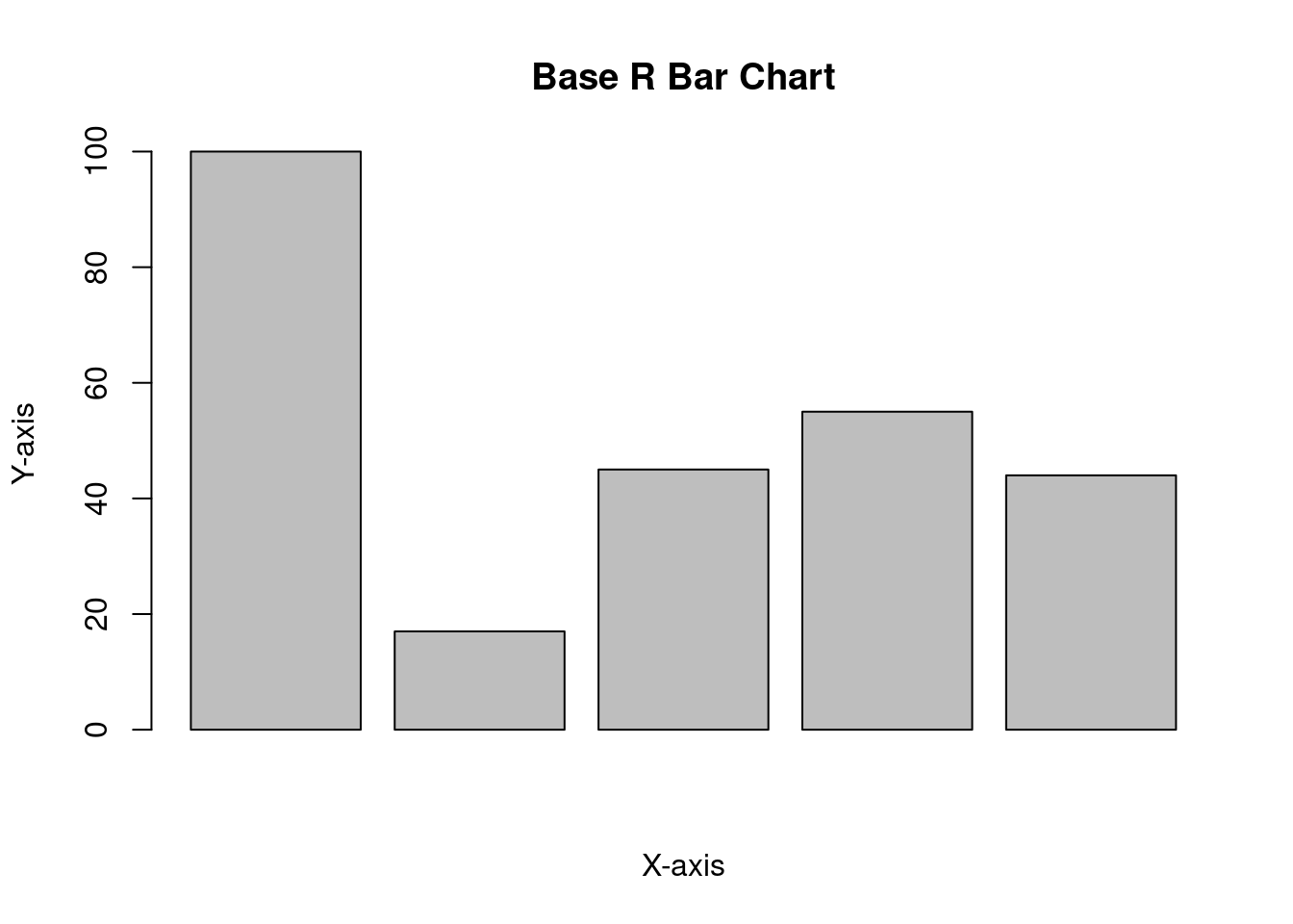
One of the strongest qualities in R is its ability to create visualizations, powered by ggplot2. However, it is possible to use base R to create plots as well. It is recommended to use ggplot2; however, you may encounter base R plots in older scripts or documentation, so an example is included for familiarity.
values <-c(100, 17, 45, 55, 44)barplot(values, xlab ="X-axis", ylab ="Y-axis", main ="Base R Bar Chart")
Figure 3.2: An example of a bar chart created using base R.
3.4 ggplot2
Before we go into visualizing our data, we should probably see what data we will be working with! Similar to how R comes preinstalled with datasets, ggplot2 also comes with prepacked data that can be utilized.
kable(head(mpg), caption ="A base R dataset: Fuel economy data from 1999 to 2008 for 38 popular models of cars.")
Table 3.2: A base R dataset: Fuel economy data from 1999 to 2008 for 38 popular models of cars.
manufacturer
model
displ
year
cyl
trans
drv
cty
hwy
fl
class
audi
a4
1.8
1999
4
auto(l5)
f
18
29
p
compact
audi
a4
1.8
1999
4
manual(m5)
f
21
29
p
compact
audi
a4
2.0
2008
4
manual(m6)
f
20
31
p
compact
audi
a4
2.0
2008
4
auto(av)
f
21
30
p
compact
audi
a4
2.8
1999
6
auto(l5)
f
16
26
p
compact
audi
a4
2.8
1999
6
manual(m5)
f
18
26
p
compact
kable(head(economics), caption ="A base R dataset: US Economic Time Series.")
Table 3.3: A base R dataset: US Economic Time Series.
date
pce
pop
psavert
uempmed
unemploy
1967-07-01
506.7
198712
12.6
4.5
2944
1967-08-01
509.8
198911
12.6
4.7
2945
1967-09-01
515.6
199113
11.9
4.6
2958
1967-10-01
512.2
199311
12.9
4.9
3143
1967-11-01
517.4
199498
12.8
4.7
3066
1967-12-01
525.1
199657
11.8
4.8
3018
kable(head(diamonds), caption ="A base R dataset: Prices of over 50,000 round cut diamonds.")
Table 3.4: A base R dataset: Prices of over 50,000 round cut diamonds.
carat
cut
color
clarity
depth
table
price
x
y
z
0.23
Ideal
E
SI2
61.5
55
326
3.95
3.98
2.43
0.21
Premium
E
SI1
59.8
61
326
3.89
3.84
2.31
0.23
Good
E
VS1
56.9
65
327
4.05
4.07
2.31
0.29
Premium
I
VS2
62.4
58
334
4.20
4.23
2.63
0.31
Good
J
SI2
63.3
58
335
4.34
4.35
2.75
0.24
Very Good
J
VVS2
62.8
57
336
3.94
3.96
2.48
kable(head(mtcars), caption ="A base R dataset: Motor Trend Car Road Tests.")
Table 3.5: A base R dataset: Motor Trend Car Road Tests.
mpg
cyl
disp
hp
drat
wt
qsec
vs
am
gear
carb
Mazda RX4
21.0
6
160
110
3.90
2.620
16.46
0
1
4
4
Mazda RX4 Wag
21.0
6
160
110
3.90
2.875
17.02
0
1
4
4
Datsun 710
22.8
4
108
93
3.85
2.320
18.61
1
1
4
1
Hornet 4 Drive
21.4
6
258
110
3.08
3.215
19.44
1
0
3
1
Hornet Sportabout
18.7
8
360
175
3.15
3.440
17.02
0
0
3
2
Valiant
18.1
6
225
105
2.76
3.460
20.22
1
0
3
1
Additionally, ggplot2 is part of the tidyverse package. So, you can either load ggplot2 or tidyverse if you want to visualize using ggplot2. Because ggplot2 is part of the tidyverse, everything you learned in Chapter ?sec-intro-tidyverse about pipelines and data manipulation carries directly into visualizations.
3.4.1 Basics
When using ggplot2, there are unlimited possibilities on what you can manipulate/influence. This may be daunting, but always remember that all plots work on the same framework.
Tipggplot2 framework
plot = data + aesthetics + geometry
No matter what ggplot you are making, no matter how many characteristics you influence, all ggplot2 needs are three things:
The data: the data being used to make the plot
The aesthetics: x/y/color/shape/etc. In ggplot2 aesthetics is shortened to aes.
The geometry: plot type (e.g., scatterplot, boxplot, etc.)
With only those three things, you can make any type of visualization you want or need. From there, you can build as far as your mind can see. When you do want to add more levels to your plot, you do so by using the + sign.
Here is an example of a basic graph made with ggplot:
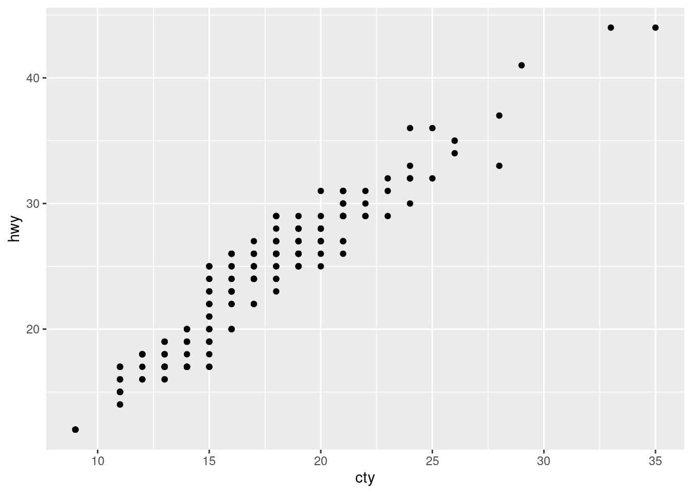
ggplot(data = mpg, aes(x = cty, y = hwy)) +geom_point()
Figure 3.3: An example of a visualization made using ggplot2.
This is our first ggplot (a scatterplot) we have created, so let’s break this down:
The data: we are using the mpg dataset.
The aesthetics: the x variable is cty and the y is hwy.
The geometry: geom_point(), which creates points on the graph.
Importantly, to add geometry, you do need to add the + sign.
With only two lines of code, a scatterplot was created! Since the framework has been established, it is time to build some visualizations!
NoteHow to move on from here:
In this chapter, there will be basic examples of each visualization type, and advanced examples of each visualization type. This is done to display the scope of what can be done with this package (ggplot2). It is encouraged to experiment with the code, change numbers, remove things, and compare and contrast the differences between the experimented visuals.
3.4.2 Scatterplot - geom_point()
When data has two continuous (for example, numeric) variables, and you want to visualize their relationship, a scatterplot is a fantastic choice. This is the basis for relationship analysis that topics such as linear regression (more about this in Chapter Section 8.1) rely on.
The geometry that needs to be specified is geom_point().
ggplot(data = mpg, aes(x = cty, y = hwy)) +geom_point()
Figure 3.4: A basic example of a scatterplot using ggplot2.
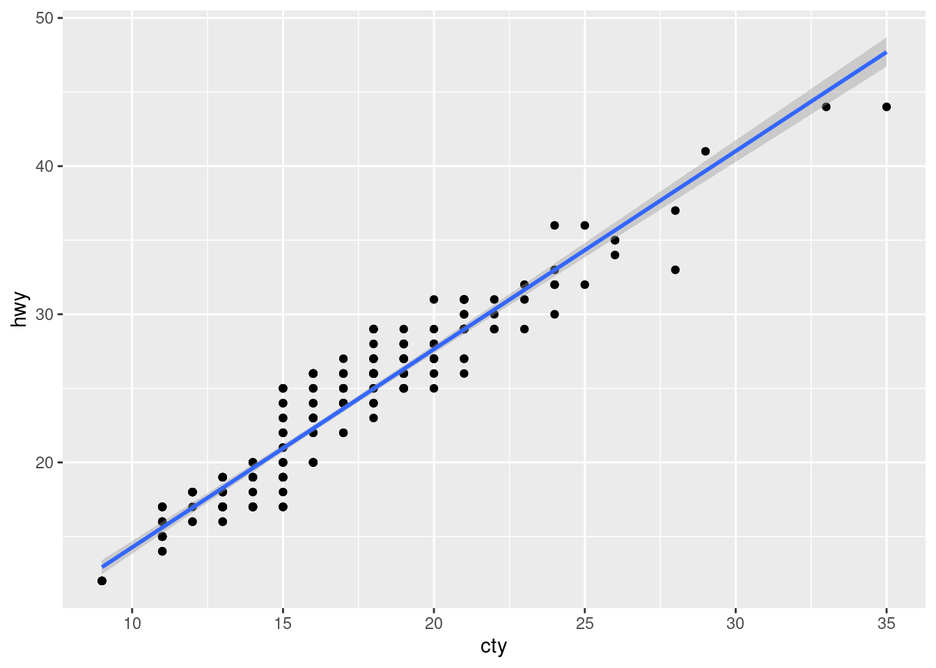
Typically it is best practice to have a “line of best fit” when creating scatterplots, similar to Anscombe’s visualization. To do that, you can utilize the geom_smooth() command.
# Line of Best Fitggplot(mpg, aes(x = cty, y = hwy)) +geom_point() +geom_smooth(method ="lm") # lm stands for "linear model"
`geom_smooth()` using formula = 'y ~ x'
Figure 3.5: An example of a scatterplot with a line of best fit.
Notice that to add geom_smooth, which is another layer of our visualization, we needed to add another + sign. It is used quite literally in ggplot2.
Let’s add some more information to our scatterplot.
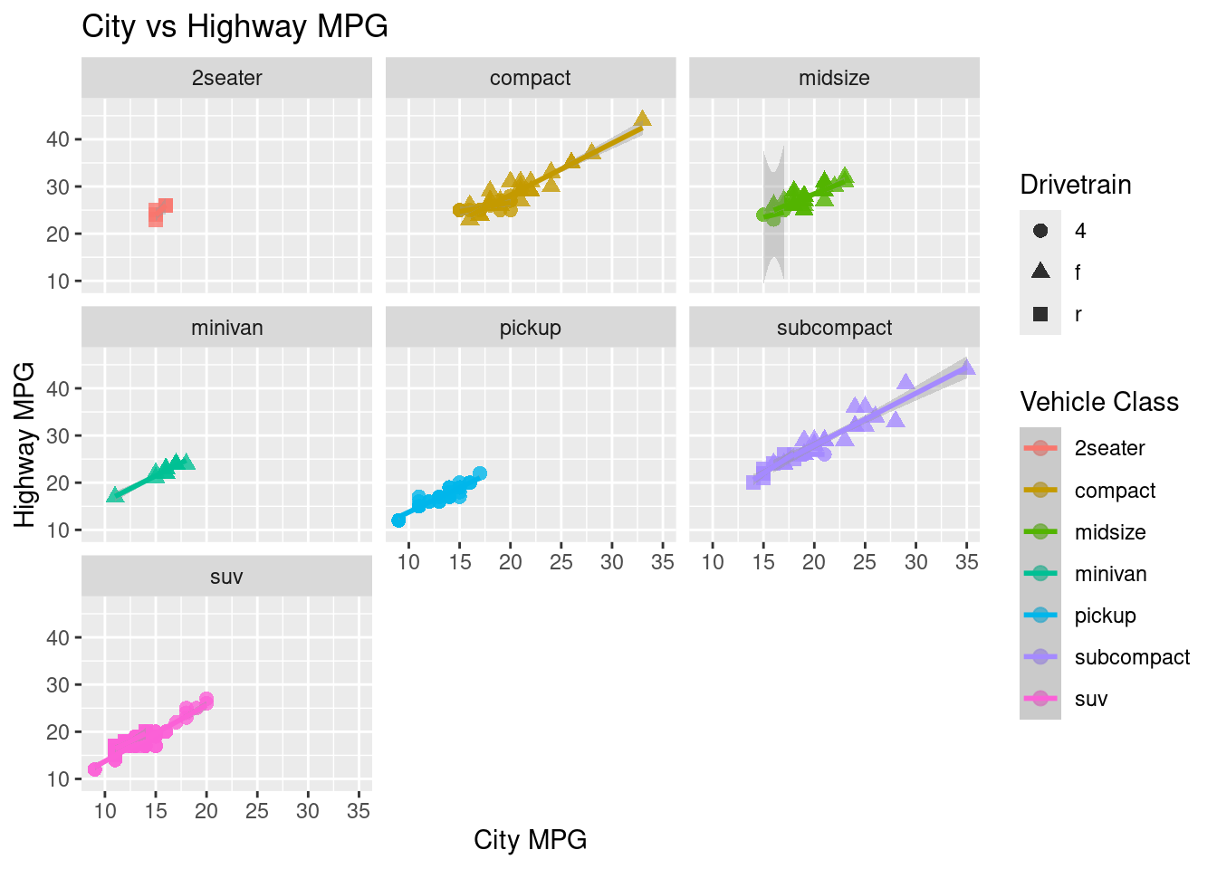
ggplot(data = mpg, aes(x = cty, y = hwy, color = class, shape = drv)) +geom_point(alpha =0.8, size =2.5) +# opacity and sizelabs(title ="City vs Highway MPG", # adds a title to the plotx ="City MPG", # adds a x-axis label to the ploty ="Highway MPG", # adds a y-axis label to the plotcolor ="Vehicle Class", # adds a color label to the plotshape ="Drivetrain"# adds a shape label to the plot ) +facet_wrap(~ class) +# breaks the graph into individual graphsgeom_smooth(method ="lm", se =TRUE) # adds a line of best fit
`geom_smooth()` using formula = 'y ~ x'
Figure 3.6: A scatterplot incorporating multiple aesthetics and faceting.
3.4.3 Bar Chart (counts) and Column Chart (values)
Bar charts visualize counts of a discrete variable, while column charts visualize pre-summarized numeric values.
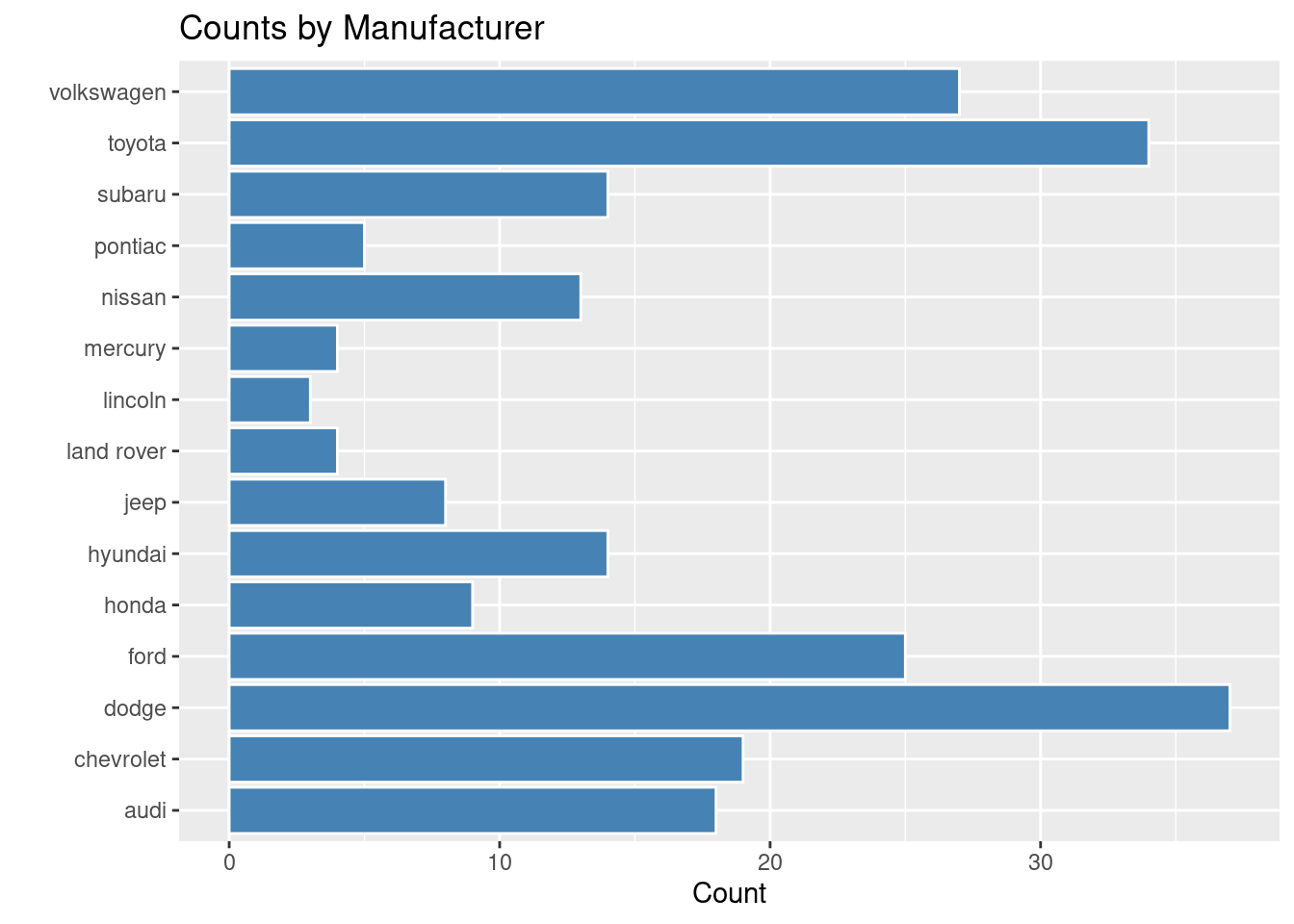
Depending on how long the variable names are, it may be best to switch the x and y axis. They would still act the same, but they would just flip on the coordinate plane. The x variable would still be the x variable, and the y would still be the y variable, but flipped. To do this, you can utilize the coord_flip() command.
ggplot(mpg, aes(x = manufacturer)) +geom_bar(fill ="steelblue", color ="white") +coord_flip() +labs(title ="Counts by Manufacturer", x ="", y ="Count")
Figure 3.8: An example of a coordinate flipped bar chart.
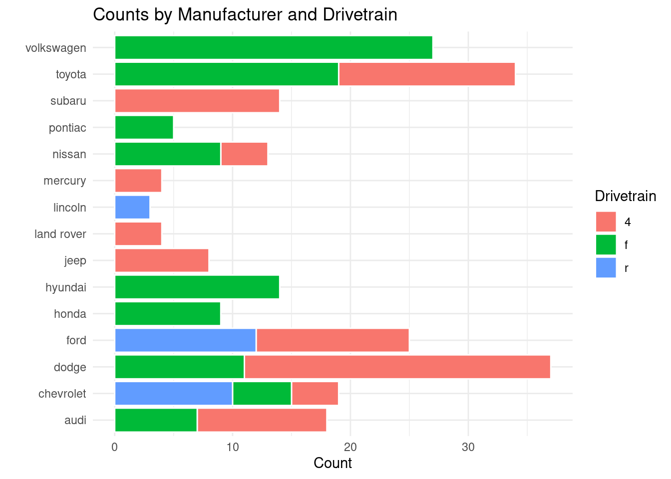
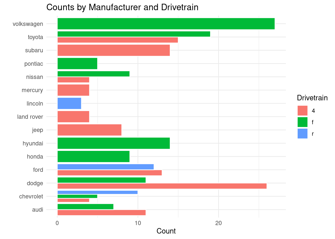
Depending on the audience, a stacked bar chart may be the best way to visualize the data. To do that, you can add position = "stack" and ggplot does the rest.
# What if we want a stacked bar chart (default with fill)?ggplot(mpg, aes(x = manufacturer, fill = drv)) +geom_bar(position ="stack", color ="white") +coord_flip() +labs(title ="Counts by Manufacturer and Drivetrain",x ="",y ="Count",fill ="Drivetrain" ) +theme_minimal()
Figure 3.9: An example of a stacked bar chart.
If you need to create a grouped bar chart instead, you can add position = "dodge" to create your visual.
#What if we want a grouped bar chartggplot(mpg, aes(x = manufacturer, fill = drv)) +geom_bar(position ="dodge", color ="white") +coord_flip() +labs(title ="Counts by Manufacturer and Drivetrain",x ="",y ="Count",fill ="Drivetrain" ) +theme_minimal()
Figure 3.10: An example of a grouped bar chart.
3.4.3.2 Column Chart - geom_col()
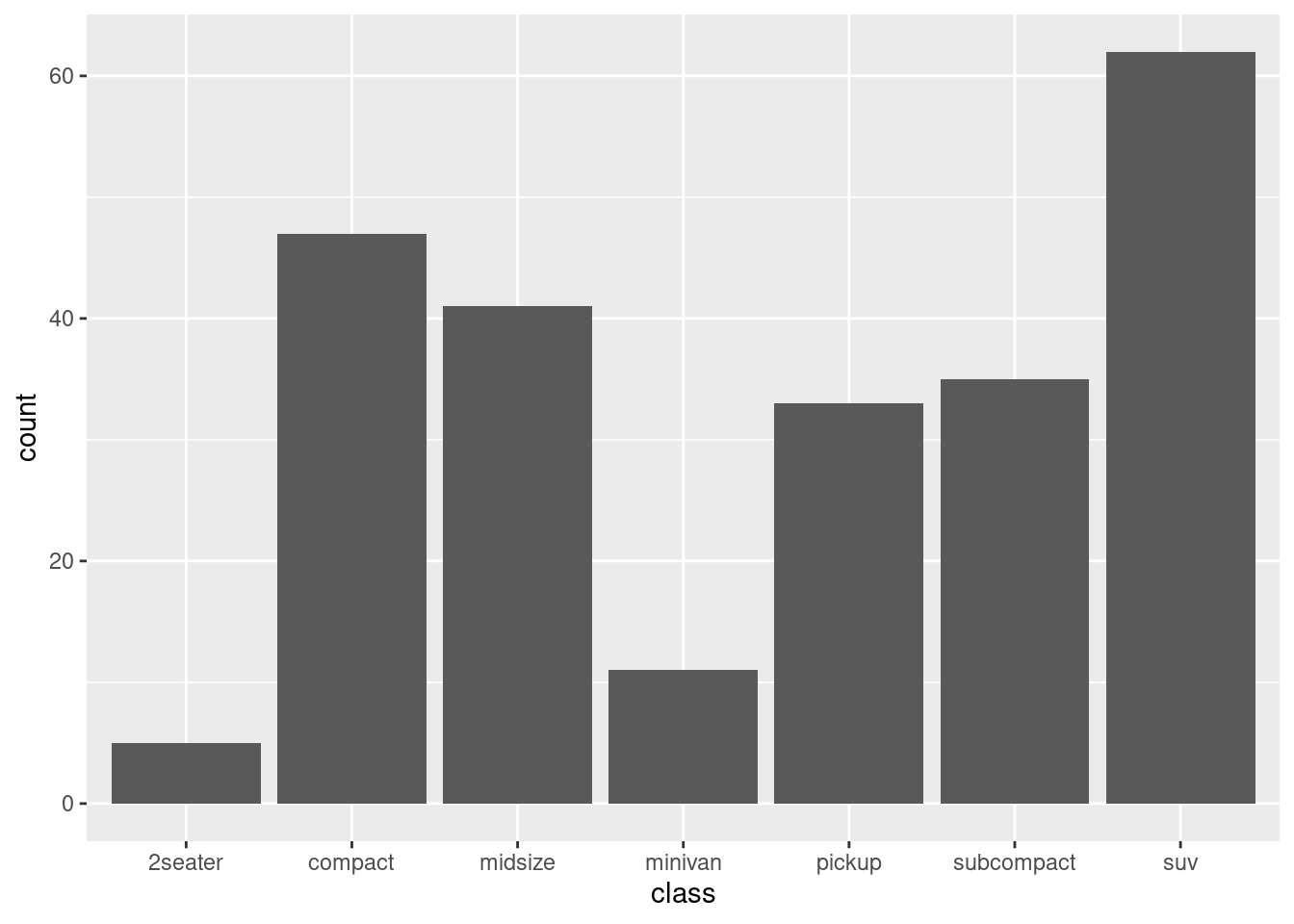
Column charts work best when you have pre-summarized values, and not raw values.
# USING PRE-SUMMARIZED VALUES - geom_col() requires explicit valuesclass_counts <- mpg %>%count(class) # counts rows by classkable(class_counts, caption ="Pre-summarized values")
Table 3.6: Pre-summarized values
class
n
2seater
5
compact
47
midsize
41
minivan
11
pickup
33
subcompact
35
suv
62
Once the values have been summarized explicitly, you use geom_col() to create a column chart.
ggplot(class_counts, aes(x = class, y = n)) +geom_col()
Figure 3.11: An example of a basic column chart.
There are a few things you can do to a column chart to add some flavor. For example:
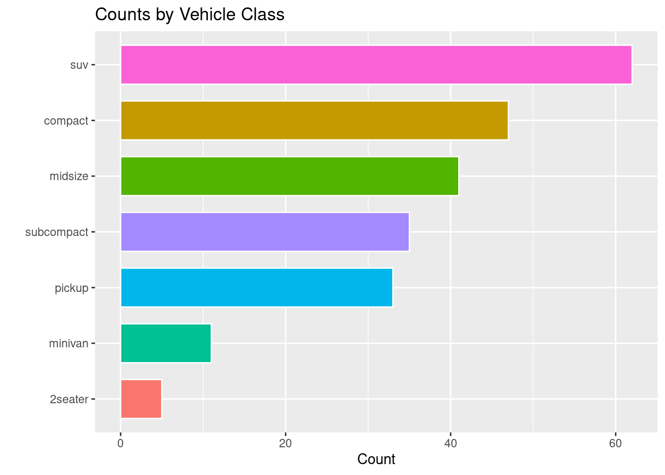
Use the reorder command to reorder the columns into ascending or descending order based on their n values.
Inside of geom_col change the width of the columns.
Depending on the bars, you can change the legend.position to a particular spot (or remove it entirely) from the visualization.
# PLUS AESTHETICS (polished)ggplot(class_counts, aes(x =reorder(class, n), y = n, fill = class)) +geom_col(width =0.7, color ="white") +# width = bar thickness, color = bordercoord_flip() +# flip for readabilitylabs(title ="Counts by Vehicle Class", x ="", y ="Count") +theme(legend.position ="none")
Figure 3.12: An example of a column chart with polished aesthetics.
NoteLegends in a graph and redundancy.
Sometimes having a legend in a graph can be redundant because of the x-axis containing the same information as a legend would. In this case, you can remove the legend not only to avoid the redundancy, but also save space.
3.4.4 Histograms and Density Plots (distribution)
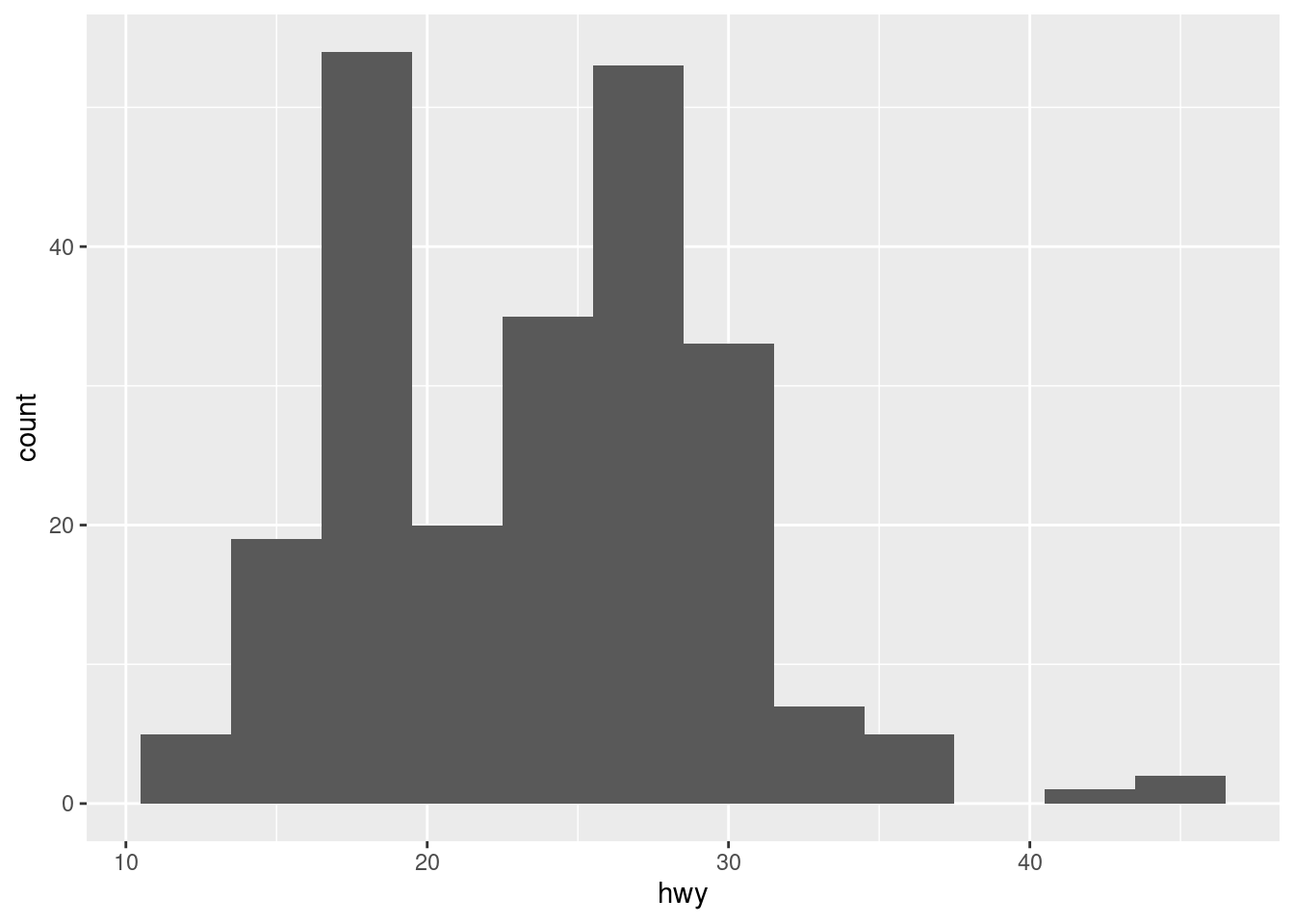
Histograms are perfect for when you are looking to display distribution.
3.4.4.1 Histograms - geom_histogram()
For the geometry of a histogram, you use geom_histogram().
R automatically assigns bins when creating a histogram unless otherwise instructed. There are several things that can be influenced:
bin width: use binwidth to change the width of the bins
boundary: use boundary to set the separation between the bins
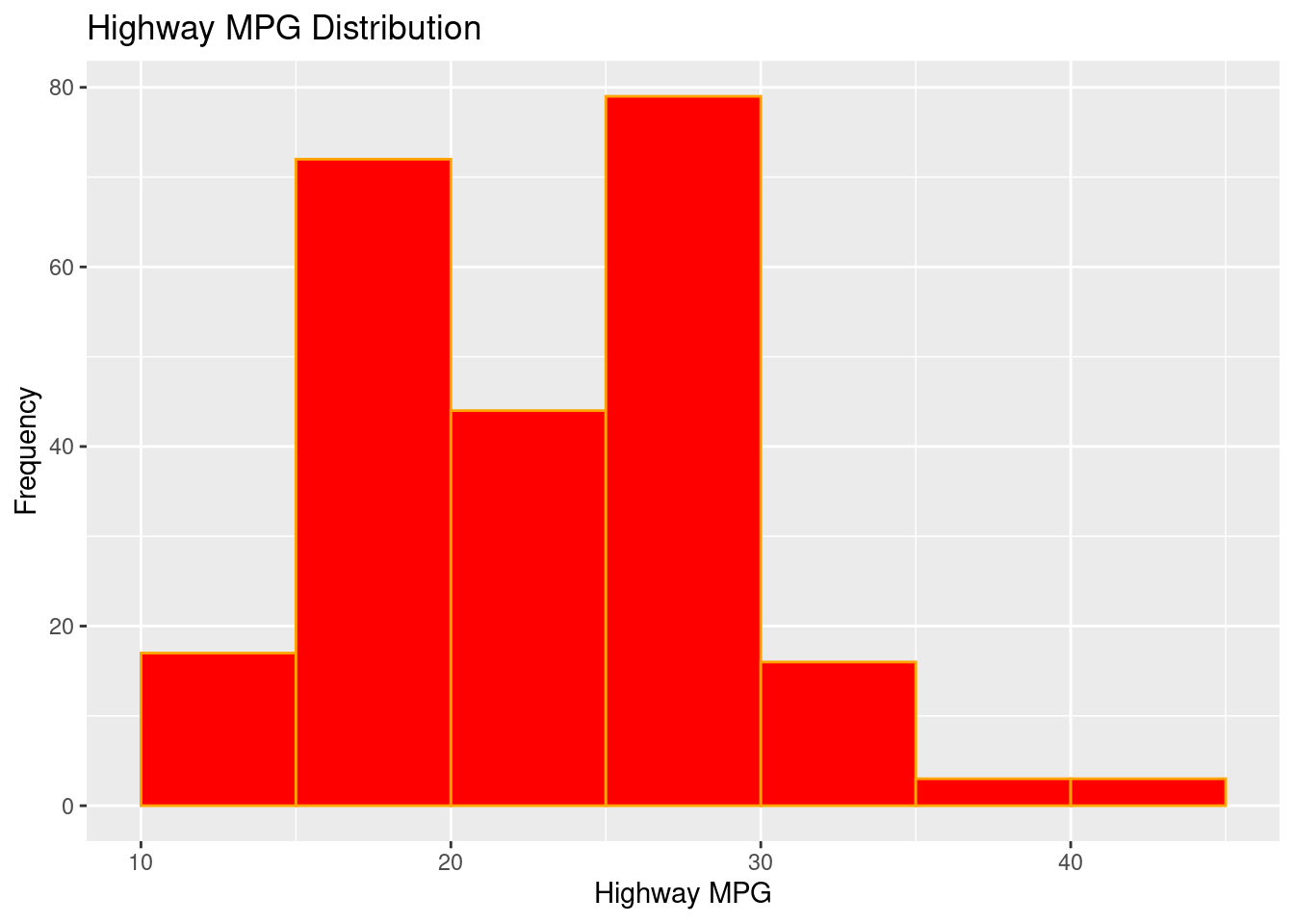
# STYLED (bin edges + colors)ggplot(mpg, aes(hwy)) +geom_histogram(binwidth =5, boundary =0,fill ="red", color ="orange") +labs(title ="Highway MPG Distribution", x ="Highway MPG", y ="Frequency")
Figure 3.14: An example of a styled histogram.
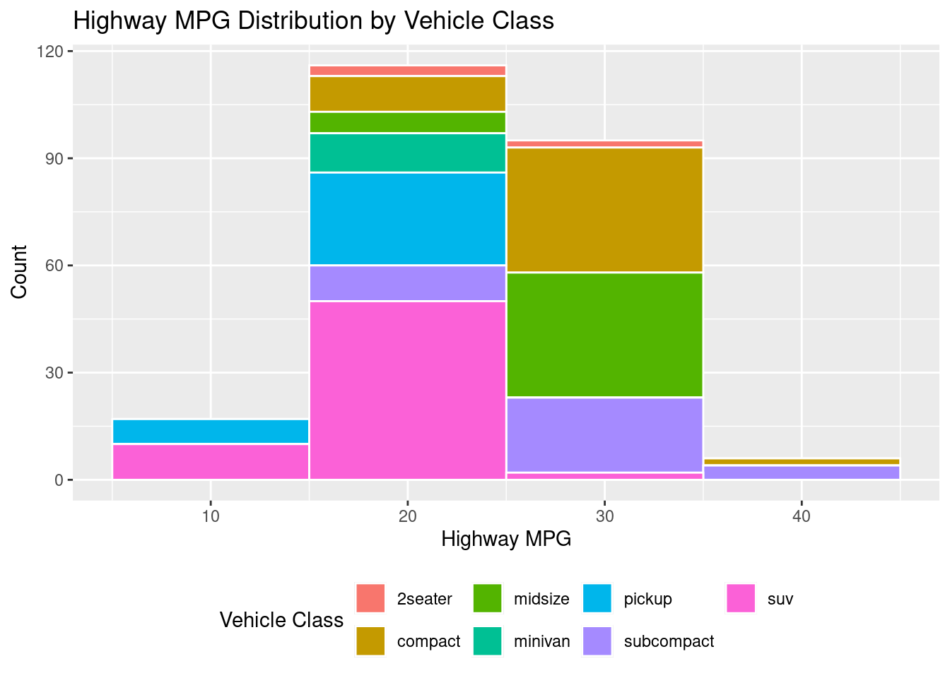
In the case that you need a stacked histogram, below is code to create that. The secret here is using the fill command.
# MAPPED FILL (stacked by class)ggplot(mpg, aes(hwy, fill = class)) +geom_histogram(binwidth =10, color ="white") +labs(title ="Highway MPG Distribution by Vehicle Class",x ="Highway MPG", y ="Count", fill ="Vehicle Class") +theme(legend.position ="bottom")
Figure 3.15: An example of a filled histogram.
3.4.4.2 Density - geom_density()
Density plots still show the distribution of data, but instead of doing it in bins like a histogram, accomplish this through an outline. The geometry for a density plot is geom_density().
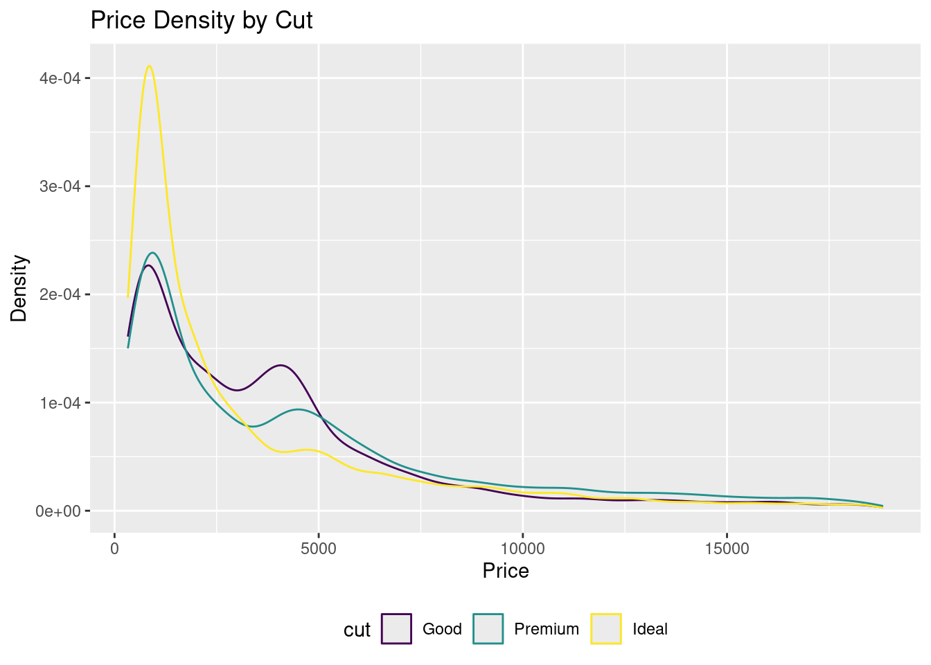
In the below example, the visualization is filtering within the data portion to only keep the cuts “Good”, “Ideal” and “Premium.” Since it is utilizing color inside the aesthetics, this will create a grouped density plot, showing three different lines for each of the three different cuts.
Note
##Regarding the data portion of the graph below: If there was no filtering, this code would still separate into different lines.
# GROUPEDggplot(diamonds %>%filter(cut %in%c("Good", "Ideal", "Premium")),aes(price, color = cut)) +geom_density() +labs(title ="Price Density by Cut", x ="Price", y ="Density") +theme(legend.position ="bottom")
Figure 3.17: An example of a grouped density plot.
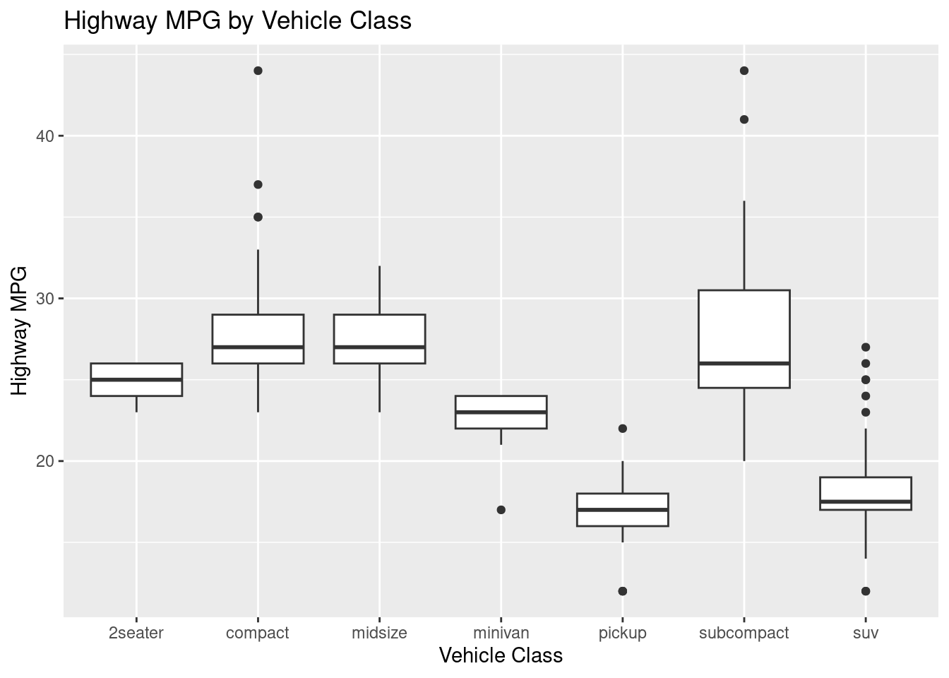
3.4.5 Boxplot - geom_boxplot()
Commonly known as a box and whisker plot, boxplots are fantastic for providing numerical insights between categorical variables. There are a few different pieces of a boxplot:
Whiskers: there are two whiskers on each boxplot
Lower Whisker: shows the lower 25% of the data. The bottom is the lowest value in the dataset
Upper Whisker: shows the upper 25% of the data. The top is the highest value in the dataset
Box: the box itself shows the middle 50% of the data. This includes:
Interquartile Range (IQR): the lowest line in the bar is the 25th percentile and the top is the 75th percentile
Median: the darker line inside of the box
Outliers: any data point that is above or below the upper and lower whisker, respectively.
The geometry for a boxplot is geom_boxplot().
# BASICggplot(mpg, aes(x = class, y = hwy)) +geom_boxplot() +labs(title ="Highway MPG by Vehicle Class", x ="Vehicle Class", y ="Highway MPG")
Figure 3.18: An example of a basic boxplot.
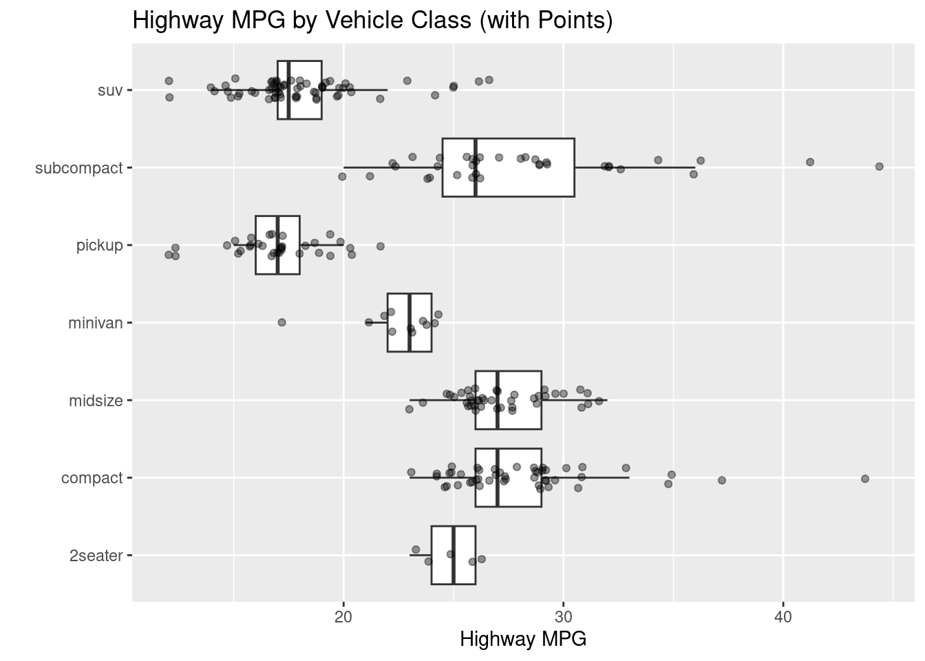
Sometimes the points on a boxplot (or any plot) can be indistinguishable due to them being so close together. In that case, utilize the geom_jitter() command.
# WITH JITTERED POINTS OVERLAIDggplot(mpg, aes(class, hwy)) +geom_boxplot(outlier.shape =NA) +geom_jitter(width =0.15, alpha =0.4, size =1.5) +coord_flip() +labs(title ="Highway MPG by Vehicle Class (with Points)",x ="", y ="Highway MPG")
Figure 3.19: An example of a boxplot with jittered points.
3.4.6 Lines (time series) - geom_line()
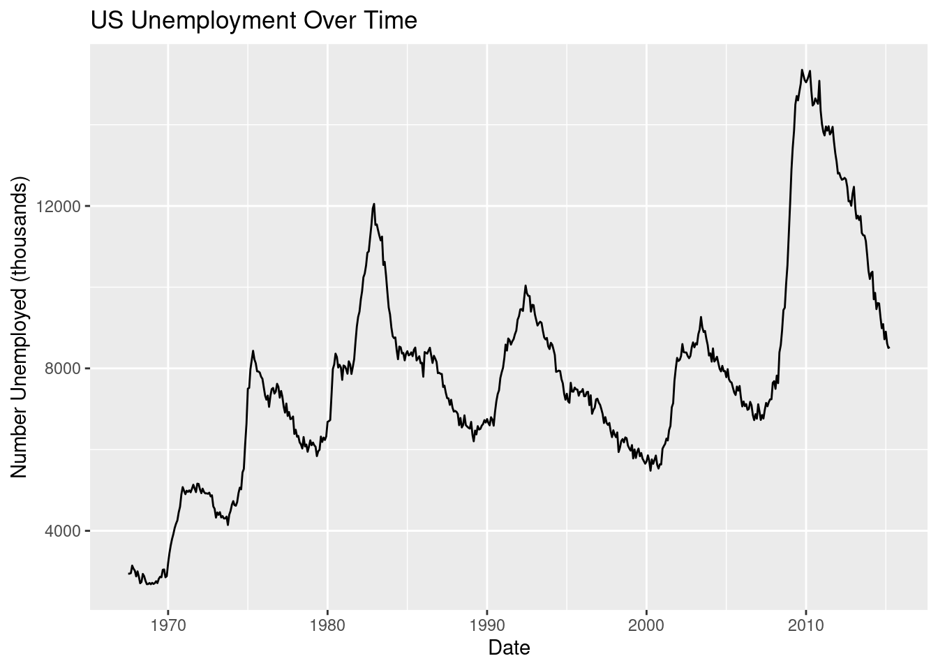
Time and time again, when working with time-series data, a line graph is created. The geometry for a line graph is geom_line().
# BASIC: unemployment over timeggplot(economics, aes(x = date, y = unemploy)) +geom_line() +labs(title ="US Unemployment Over Time",x ="Date", y ="Number Unemployed (thousands)")
Figure 3.20: An example of a basic line graph.
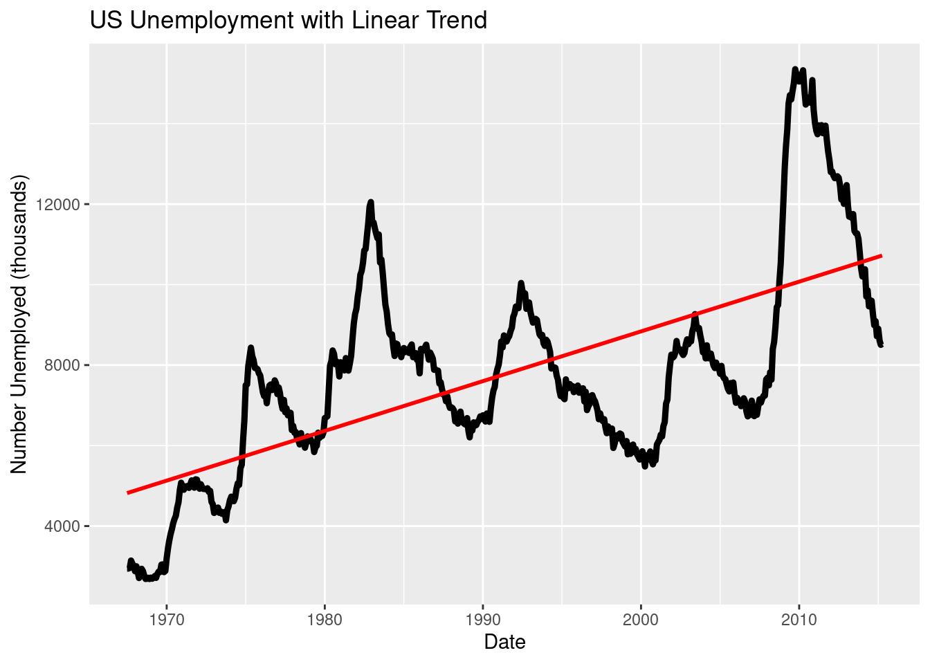
Like in the scatterplot, you can add a line of best fit.
# PLUS: LM vs LOESS contrastggplot(economics, aes(date, unemploy)) +geom_line(linewidth =1.6) +geom_smooth(method ="lm", se =FALSE, color ="red") +labs(title ="US Unemployment with Linear Trend",x ="Date", y ="Number Unemployed (thousands)")
`geom_smooth()` using formula = 'y ~ x'
Figure 3.21: An example of line graph with a LM line of best fit.
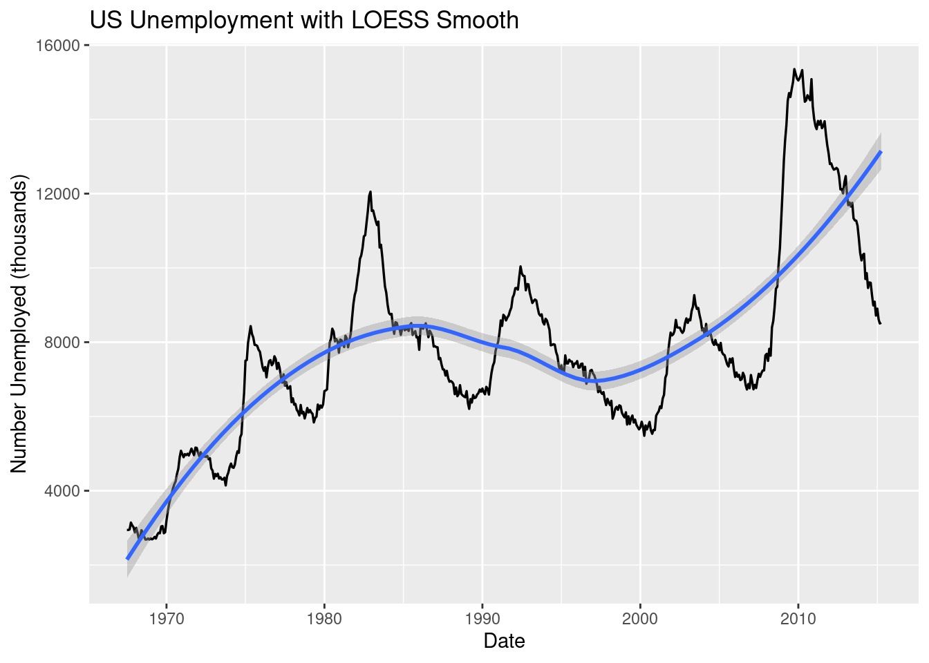
Instead of using “lm” for our method, let’s try “loess” and see our results.
ggplot(economics, aes(date, unemploy)) +geom_line(linewidth =0.6) +geom_smooth(method ="loess", se =TRUE) +# loess = flexible smoothing; se = confidence bandlabs(title ="US Unemployment with LOESS Smooth",x ="Date", y ="Number Unemployed (thousands)")
`geom_smooth()` using formula = 'y ~ x'
Figure 3.22: An example of line graph with a LM line of best fit.
3.4.7 Put text on the plot - geom_text()
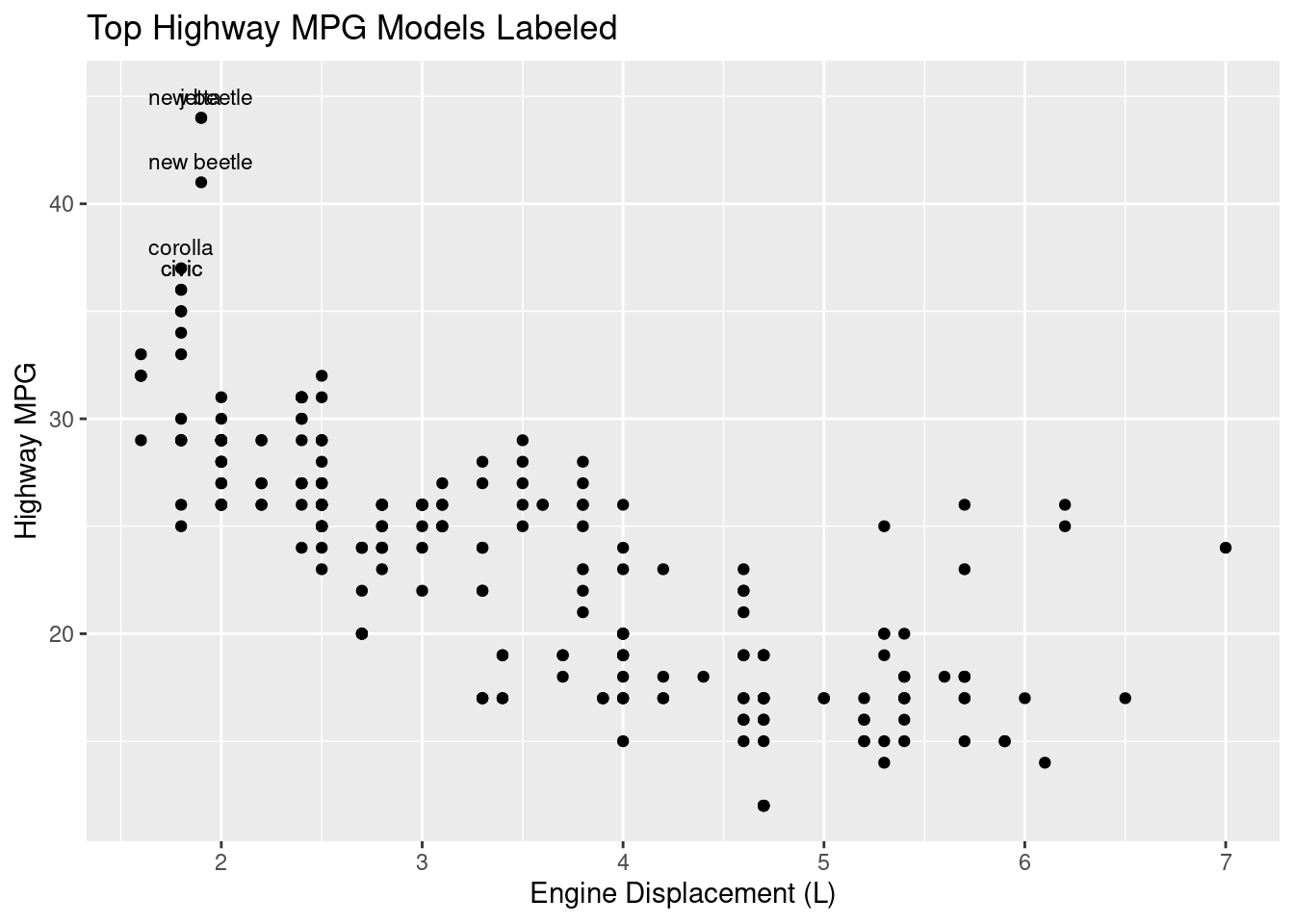
No matter the type of plot, it may help the viewer understand your plot better if you add labels to some of your data points, for example, the most extreme. To do this, utilize the geom_text() command.
Figure 3.23: An example of adding text inside a plot.
The code above first identifies the top three hwy values using slice_max(), pairs that with geom_text() and labels only the extreme data points. Now, viewers can read from the plot which model of cars have the best highway miles per gallon.
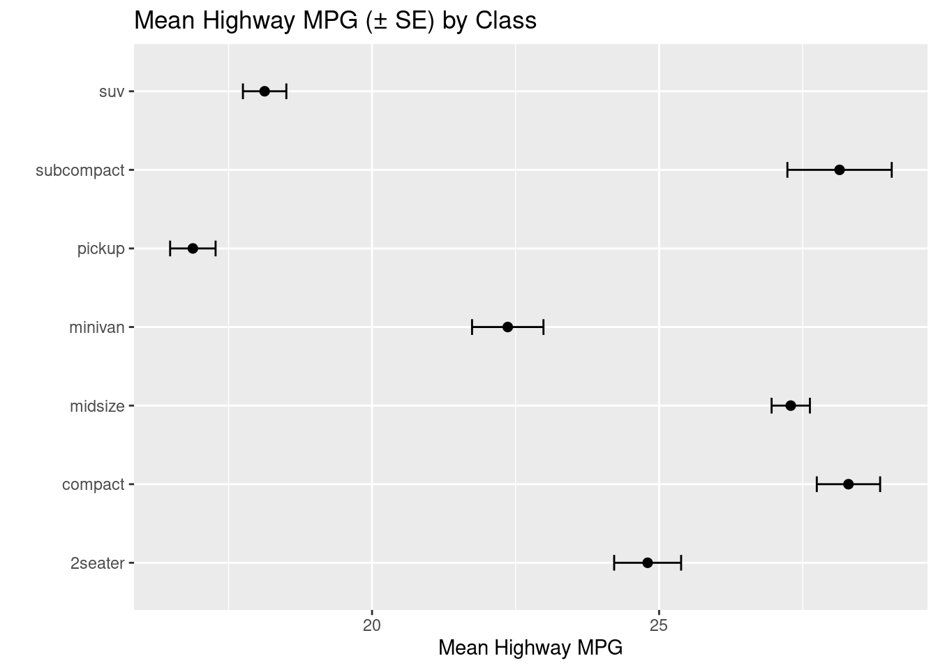
Once completed, you can utilize the geom_errorbar() command to add error bars to your plot.
# Points + error bars (plot error bars first so points sit on top)ggplot(summ_hwy, aes(class, mean_hwy)) +geom_errorbar(aes(ymin = mean_hwy - se_hwy, ymax = mean_hwy + se_hwy), width =0.2) +geom_point(size =2) +coord_flip() +labs(title ="Mean Highway MPG (± SE) by Class", x ="", y ="Mean Highway MPG")
Figure 3.24: An example of a plot with error bars.
3.4.9 Reference lines
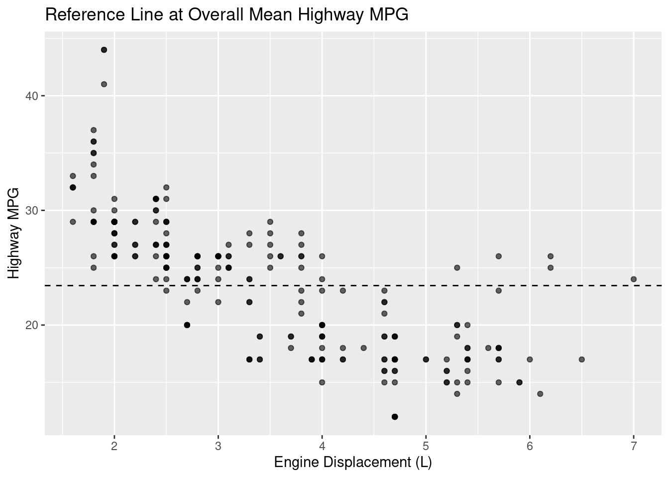
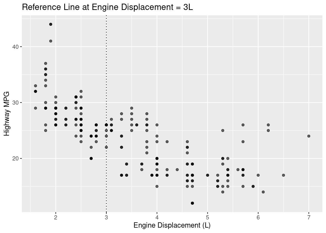
Let’s say there is a scenario where you are looking for data above and below a particular threshold. In this case, reference lines can become an essential tool for yourself and your viewers. Once the threshold is established (mean, median, really any number of significance to you), you can utilize the geom_hline() or the geom_vline() commands to create horizontal or vertical reference lines, respectively.
# Horizontal line at overall meanoverall_mean <-mean(mpg$hwy, na.rm =TRUE)ggplot(mpg, aes(displ, hwy)) +geom_point(alpha =0.6) +geom_hline(yintercept = overall_mean, linetype ="dashed") +labs(title ="Reference Line at Overall Mean Highway MPG",x ="Engine Displacement (L)", y ="Highway MPG")
Figure 3.25: An example of plot with a horizontal reference line.
# Vertical line at displ = 3ggplot(mpg, aes(displ, hwy)) +geom_point(alpha =0.6) +geom_vline(xintercept =3, linetype ="dotted") +labs(title ="Reference Line at Engine Displacement = 3L",x ="Engine Displacement (L)", y ="Highway MPG")
Figure 3.26: An example of plot with a vertical reference line.
3.5 Key Takeaways
Always visualize your data! Summary statistics can hide patterns (and problems) in your data.
ggplot2 follows a consistent grammar: data + aesthetics + geometry.
Use labs(), theme(), and coord_flip() to improve clarity and readability.
facet_wrap() helps compare groups by creating small multiples.
Trend lines (geom_smooth()), error bars (geom_errorbar()), labels (geom_text()), and reference lines (geom_hline(), geom_vline()) help communicate the story in your data.
3.6 Checklist
When creating a visualization, have you:
3.7 ggplot2 Visualization Reference
Unlike other chapters, visualization relies on combining multiple components rather than calling single functions. This section serves as a reference for common geometries, aesthetics, and commands used throughout the book.
3.7.1 Summary of ggplot Geometries
Below is a list of plot types, their purpose, and the geom command used:
Scatterplot - Relationships - geom_point()
Bar Chart - Counts - geom_bar()
Column Chart - Pre-summarized values - geom_col()
Histogram - Distribution - geom_histogram()
Density Plot - Distribution - geom_density()
Boxplot - Group comparison - geom_boxplot()
Line Graph - Time - geom_line()
3.7.2 Summary of other ggplot commands
Below is a list of other commands used to alter plots:
Aesthetics:
color: Changes the color of the points.
shape: Changes the shape of the points.
alpha: Changes the opacity of the point.
size: Changes the size of the point.
fill: Controls the interior color of shapes
labs(): Creates labels, including title, x-axis, and y-axis.
facet_wrap(): Creates individual plots and puts it into one graphic.
coord_flip(): Flips the axes without changing the underlying variables.
theme(): Controls the overall appearance of the plot
theme_minimal(): Makes the most basic looking plot.
theme(legend.position = "..."): Dictates where (if at all) the legend appears on the plot.
geom_text(): Adds text to the data points within the plot.
geom_hline(): Adds a horizontal reference line.
geom_vline(): Adds a vertical reference line.
geom_smooth(): Adds trend lines.
reorder(): Reorders categorical variables based on the values of another variable.
3.8 💡 Reproducibility Tip:
With visualizations (especially in R) there are nearly limitless possibilities. To support reproducibility, aim to create figures that clearly communicate their purpose even when viewed on their own.
When creating a visualization, ask yourself:
What question is this visualization answering?
What do I want my audience to understand from it?
What would someone understand if they saw this figure without any surrounding text?
To help close the gap between these questions, use informative labels and captions, that will help guide users on what they’re seeing.
Within ggplot2, functions like labs() allow you to clearly label axes, titles, and legends so the intent of the plot is immediately clear. When working in R Markdown or bookdown (Section C.4.3.2.2), figure captions (using fig-cap) provide additional context that travels with the figure wherever it appears.
Visualizations that are well-labeled and properly captioned are easier to interpret, reuse, and reproduce—both by others and by your future self.