In everyday communication, the word correlation is thrown around a lot, but, what does it actually mean? In this lesson, we will explore how to use correlations to better understand how our variables interact with each other.
NoteWe’ll be trying to answer the question:
How do anxiety scores and studying time influence exam scores?
We’ll use a dataset called Exam_Data.xlsx, which includes students’ exam scores, anxiety levels just before the test, and total hours spent studying.
7.1.1 Learning Objectives
By the end of this chapter, you will be able to:
Interpret the direction and strength of correlations.
Compute correlations in R using cor() and cor.test().
Explain and calculate R² as variance explained.
Run and interpret partial and point-biserial correlations.
Visualize relationships using scatterplots and correlation matrices.
7.2 Loading Our Data
We start by importing the necessary packages, reading in our Excel file, and quickly doing an overview of the data. For a quick review on loading data into R, refer back to Section 1.7.
Table 7.1: The skim function provides us with value information for a first look at our data.
Data summary
Name
examData
Number of rows
100
Number of columns
5
_______________________
Column type frequency:
character
2
numeric
3
________________________
Group variables
None
Variable type: character
skim_variable
n_missing
complete_rate
min
max
empty
n_unique
whitespace
Student Name
0
1
3
9
0
99
0
First Generation College Student
0
1
2
3
0
2
0
Variable type: numeric
skim_variable
n_missing
complete_rate
mean
sd
p0
p25
p50
p75
p100
hist
Studying Hours
0
1
20.15
18.29
0.00
8.00
15.00
24.25
98.00
▇▃▁▁▁
Exam Score
0
1
57.38
25.72
5.00
40.00
61.50
80.00
100.00
▃▃▅▇▅
Anxiety Score
0
1
74.05
17.33
0.06
69.37
78.24
84.69
97.58
▁▁▁▆▇
Our data has 5 columns:
Student Name: The name of the student
Studying Hours: The number of hours they studied for the exam
Exam Score: The score they earned on their exam
Anxiety Score: The measure of their anxiety levels before the exam
First Generation College Student: If the student is or is not a first generation college student (like me)
While we have all of the data needed to begin answering our question, there is one flaw: there are spaces in our column headers.
7.3 Cleaning our data
Not only does R love it when our column headers do not have spaces, it is also best practice for making our analyzes reproducible.
We could use the rename() command from the dplyr package like in Section Section 2.4.7, but there is more than one column, so we can streamline this process. Using the clean_names() function from the janitor package, we can easily remove the spaces in our column names
library(janitor)
Warning: package 'janitor' was built under R version 4.5.2
Attaching package: 'janitor'
The following objects are masked from 'package:stats':

    chisq.test, fisher.test
Looking at the before and after, we see that the clean_names() function replaced every space within our column headers and replaced them with underscores. Notice how it also turned all of the letters to lowercase (also best practice for reproducibility). Now we can begin our journey.
7.4 Visualizing Relationships
Before we start running any statistical analyses, we always want to begin by graphing our data, providing us with a visual understanding of what story our data is telling us. With correlations, we want to focus on scatterplots. As a reminder, a scatterplot needs two numerical values.
Since we are trying to better understand exam data, let’s create three scatterplots: one showing the relationship between studying and exam scores, one between anxiety and exam scores, and one between studying and anxiety. If you haven’t already, take some time to review scatterplots in Section Section 3.4.2.
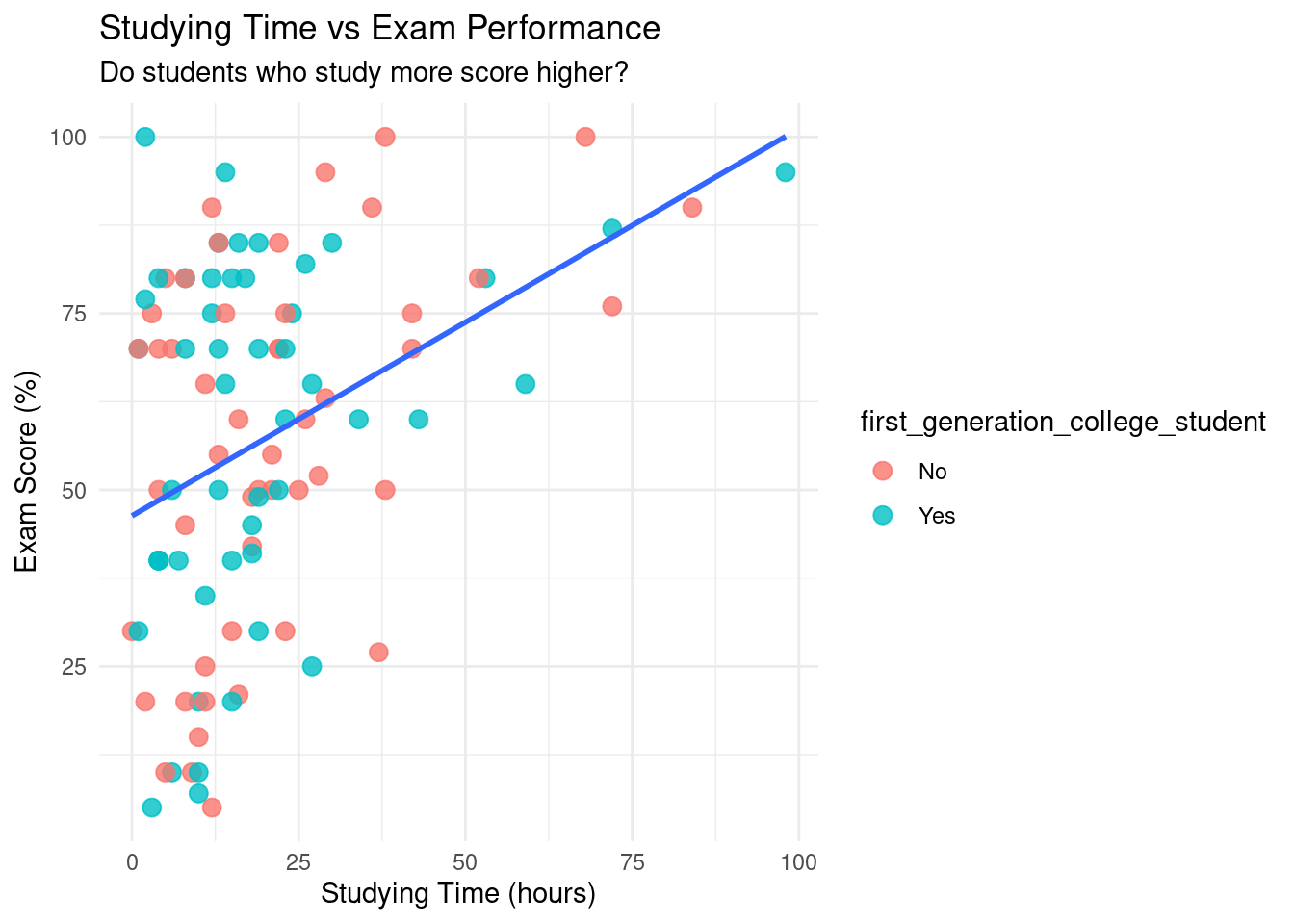
p1 <-ggplot(examData, aes(x = studying_hours, y = exam_score)) +geom_point(aes(color = first_generation_college_student), size =3, alpha =0.8) +geom_smooth(method ="lm", se =FALSE) +theme_minimal() +labs(title ="Studying Time vs Exam Performance",subtitle ="Do students who study more score higher?",x ="Studying Time (hours)", y ="Exam Score (%)" )p1
`geom_smooth()` using formula = 'y ~ x'
Figure 7.1: Scatterplot showing the relationship between studying time and exam performance, with points colored by if they’re a first generation college student and a fitted linear trend line. The upward trend suggests a positive linear association, indicating that students who spend more time studying tend to achieve higher exam scores. This visualization motivates the use of a correlation coefficient to quantify the strength of the relationship.
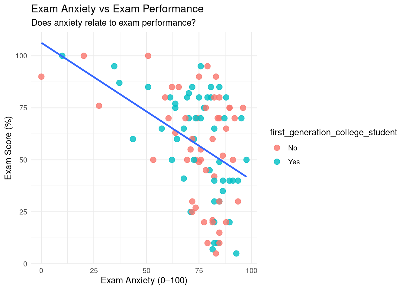
p2 <-ggplot(examData, aes(x = anxiety_score, y = exam_score)) +geom_point(aes(color = first_generation_college_student), size =3, alpha =0.8) +geom_smooth(method ="lm", se =FALSE) +theme_minimal() +labs(title ="Exam Anxiety vs Exam Performance",subtitle ="Does anxiety relate to exam performance?",x ="Exam Anxiety (0–100)", y ="Exam Score (%)" )p2
`geom_smooth()` using formula = 'y ~ x'
Figure 7.2: Scatterplot illustrating the relationship between exam anxiety and exam performance, with a fitted linear trend line. The downward trend indicates a negative linear association, suggesting that higher anxiety levels are associated with lower exam scores. This visualization supports the use of correlation to formally assess the direction and strength of the relationship.
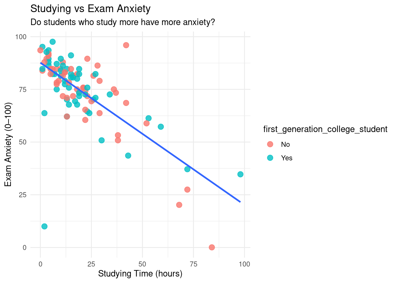
p3 <-ggplot(examData, aes(x = studying_hours, y = anxiety_score)) +geom_point(aes(color = first_generation_college_student), size =3, alpha =0.8) +geom_smooth(method ="lm", se =FALSE) +theme_minimal() +labs(title ="Studying vs Exam Anxiety",subtitle ="Do students who study more have more anxiety?",x ="Studying Time (hours)", y ="Exam Anxiety (0–100)" )p3
`geom_smooth()` using formula = 'y ~ x'
Figure 7.3: Scatterplot displaying the relationship between studying time and exam anxiety, with points colored by if they’re a first generation college student and a fitted linear trend line. The negative linear pattern suggests that increased study time is associated with lower anxiety levels, providing visual evidence of a linear relationship prior to computing a correlation coefficient.
Intuitively, these graphs make sense (which is what we want to see). From a visual perspective:
Graph 1 indicates that as someone studies more for the exam, they do better on the exam (a Christmas miracle!).
Graph 2 indicates that the more anxiety someone has, the worse they’ll perform on the exam.
Graph 3 indicates that the more time you spend studying for an exam, the less anxiety you will have before the exam.
One of the main reasons why we visualize our data is to see if it is linear. We are only going to be talking about linear relationships in this chapter.
WarningBe careful with your scatterplots:
If your scatterplot ever shows a curve, use a non-parametric alternative like Spearman’s rank correlation instead.
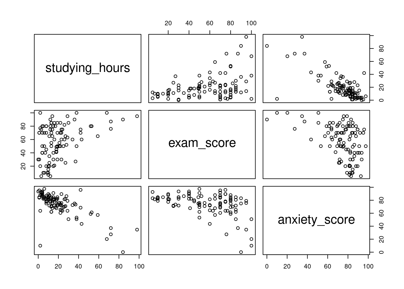
For today, we are focusing on studying time, anxiety scores, and exam scores. If we did not want to manually create 3 different scatterplots, we could utilize the pairs command.
Figure 7.4: Scatterplot matrix displaying pairwise relationships among studying time, exam performance, and exam anxiety. Each panel shows the relationship between two variables, allowing for simultaneous assessment of direction, strength, and linearity prior to formal correlation analysis.
This creates a scatterplot for all of the columns we specify. It may take a while to get used to reading this, but the way to read these is where the names would intersect is the scatterplot that represents those two variables. For example, the exam vs studying scatterplot would be the top middle scatterplot.
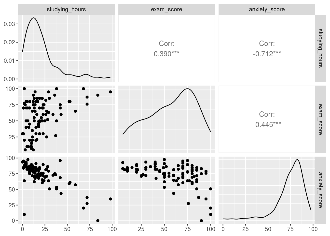
We can get even fancier and use the command ggpairs from the GGally function.
Figure 7.5: Enhanced scatterplot matrix displaying pairwise relationships among studying time, exam performance, and exam anxiety. The diagonal panels show variable distributions, while off-diagonal panels display scatterplots and correlation coefficients. This visualization allows for simultaneous assessment of linearity, direction, strength of association, and distributional properties prior to formal correlation analysis.
This not only creates the three scatterplots, but also creates a histogram in the form of a line, and spoiler, the correlation coefficient for all combinations!
7.5 Running Correlations (r)
Since the cat is out of the bag, it is now time for us to officially run some correlations.
The end result of running a correlation is to get the correlation coefficient (r), which is a number between -1 and 1. There are two things we look for in a correlation coefficient:
Direction: this is denoted by whether the coefficient is negative or positive. A negative number does not mean it is bad, and a positive number does not mean it is good. It is simply saying that if it is:
Negative- then when one variable increases, the other decreases (Anxiety vs Exam)
Positive- when one variable increases, the other also increases (Studying vs Exam)
Strength: this is how close to -1 or 1 it is. The closer to -1 or 1, the stronger the correlation between the two variables. The inverse is also true: the closer to 0 the number is, the weaker the correlation is.
By definition, the correlation coefficient measures the strength and direction of a linear relationship between two variables.
We can use the following general guidelines for interpreting correlation strength. However, different disciplines may have different guidelines.
Table 7.2
Absolute value of r
Strength of relationship
r < 0.25
No relationship
0.25 < r < 0.5
Weak relationship
0.5 < r < 0.75
Moderate relationship
r > 0.75
Strong relationship
Now that we understand what the correlation coefficient (r) represents, let’s calculate it! We can use the cor command for this.
cor(examData$studying_hours, examData$exam_score) # Study time vs performance
[1] 0.3900419
cor(examData$anxiety_score, examData$exam_score) # Anxiety vs performance
[1] -0.4449023
cor(examData$studying_hours, examData$anxiety_score) # Study time vs anxiety
[1] -0.7122237
Success! We have three different correlation coefficients. Let us look at all three:
A positive, somewhat weak correlation
A negative, somewhat weak correlation
A negative, somewhat strong correlation
Now, we can also utilize the cor.test command, which not only will give us the correlation coefficient, but also the p-value, so we can identify if the correlation is statistically significant or not.
cor.test(examData$studying_hours, examData$exam_score) # Study time vs performance
    Pearson's product-moment correlation

data:  examData$studying_hours and examData$exam_score
t = 4.1933, df = 98, p-value = 6.034e-05
alternative hypothesis: true correlation is not equal to 0
95 percent confidence interval:
 0.2096883 0.5447277
sample estimates:
      cor
0.3900419
cor.test(examData$anxiety_score, examData$exam_score) # Anxiety vs performance
    Pearson's product-moment correlation

data:  examData$anxiety_score and examData$exam_score
t = -4.9178, df = 98, p-value = 3.524e-06
alternative hypothesis: true correlation is not equal to 0
95 percent confidence interval:
 -0.5897813 -0.2722777
sample estimates:
       cor
-0.4449023
cor.test(examData$studying_hours, examData$anxiety_score) # Study time vs anxiety
    Pearson's product-moment correlation

data:  examData$studying_hours and examData$anxiety_score
t = -10.044, df = 98, p-value < 2.2e-16
alternative hypothesis: true correlation is not equal to 0
95 percent confidence interval:
 -0.7971286 -0.5996997
sample estimates:
       cor
-0.7122237
Turns out all three are statistically significant! There’s something just as important as the r value and p value: the method used to calculate it. By default cor and cor.test use Pearson’s method. Going back to visualizing our data, we can only use Pearson’s method if our data is linear.
TipRunning one by one can take a lot of time.
What if we do not want to run all the correlations one by one…
7.6 Correlation Matrix
Right now, we only have three variables we want to run correlations with. But, what if we had 50? Are we going to run 50 lines of code? No! We can, instead, run a correlation matrix, which conducts a correlation between any and all numeric values. The key here is that your data must only contain numeric values, so make sure you clean your data first. Again, as before, we can utilize the cor command.
TipHint:
Use = “pairwise.complete.obs” handles any missing values safely
# Selecting numeric variables only (if dataset contains non-numeric columns)library(tidyverse)examData_numeric <- examData %>% dplyr::select(where(is.numeric))corr_matrix <-cor(examData_numeric, use ="pairwise.complete.obs")corr_matrix
Boom! We were able to calculate the correlation coefficients in one line of code for all three variables. We are always aiming to get the most done with as little code as possible.
7.7 Coefficient of Determination (R^2)
Once you have a correlation coefficient, what’s next? Well, with the correlation coefficient, we can then calculate R^2, otherwise known as the coefficient of determination, which measures the proportion of variance in one variable that is explained by the other. In simple correlations, R² is just r², the square of the correlation coefficient.
R^2 tells us how much of the variance in Y is explained by X. We can use a combination of the cor command and base R.
# R^2 tells us the percentage of variance shared between two variables.# Calculating the R^2 valuecor(examData$anxiety_score, examData$exam_score)^2
[1] 0.197938
# Making it look prettyround(cor(examData$anxiety_score, examData$exam_score)^2*100,2)
[1] 19.79
# What about the others?cor(examData$studying_hours, examData$exam_score)^2*100
19.45% of all the variation of exam scores is associated with anxiety.
15.74% of all the variation of exam scores is associated with studying time.
50.30% of all the variation of anxiety scores is associated with studying time.
Number three seems particularly strong. There may be more to investigate here.
7.8 Partial Correlations
When we were looking at our R^2 values, we saw a decent percentage of the variation in exam scores was due to both anxiety scores and studying time. We also saw that half of the variation in anxiety scores was due to studying time. So, maybe, there is some overlap between anxiety+studying time and exam scores.
To account for this, we can utilize the ppcor library and run a partial correlation using the pcor.test command.
TipHint:
When running a partial correlation using pcor.test, the last variable in the command is the one being controlled for.
library(ppcor)# Partial correlation between Anxiety and Exam controlling for Studyingpcor.test(examData$anxiety_score, examData$exam_score, examData$studying_hours)
    estimate    p.value statistic   n gp  Method
1 -0.2585344 0.00977182 -2.635883 100  1 pearson
# Uno reverse: controlling for Anxiety instead of Studyingpcor.test(examData$studying_hours, examData$exam_score, examData$anxiety_score)
   estimate   p.value statistic   n gp  Method
1 0.1163946 0.2512544  1.154199 100  1 pearson
After controlling for studying time, we now see that:
The correlation coefficient is still negative between anxiety scores and exam scores, but it is cut by nearly half!
The correlation coefficient is still positive between studying time and exam scores, but now, not only is it not as strong, but it is not even statistically significant.
This confirms our suspicion that the relationship between anxiety and exam performance partly overlaps with study time. Once we control for study time, the unique relationship between anxiety and exam scores becomes weaker — showing that part of the correlation was actually due to study habits.
Logically, this makes sense: the more you study, the less anxiety you will have! So maybe, just maybe, you’ll consider studying for your next exam.
7.9 Biserial and Point-Biserial Correlations
Now, what about if you have logical variables? T/F, Yes/No, M/F, etc? How can we run a correlation on them if they are not numeric? Great question! What we can do is turn them into “numeric” values, turning them into 0’s and 1’s, and then run a correlation.
# What do you do when you have a biserial (you're either dead or alive)# Or when you have a point-biserial (failed by 1 pts vs failed by 42 pts vs passed by 4pts)examData$college_binary <-ifelse(examData$first_generation_college_student=="No",0,1)cor.test(examData$exam_score, examData$college_binary)
    Pearson's product-moment correlation

data:  examData$exam_score and examData$college_binary
t = 0.30181, df = 98, p-value = 0.7634
alternative hypothesis: true correlation is not equal to 0
95 percent confidence interval:
 -0.1669439  0.2255416
sample estimates:
      cor
0.0304735
From this, we can see that being a first generation college student does not significantly correlate with exam scores.
7.10 Grouped Correlations
While being a first generation college student may not be a strong correlation, maybe there are differences within the groups, and a grouped correlation should be conducted. To do this, all we need to do is first group by first generation college student, and then run correlations on our desired variables.
examData %>%group_by(first_generation_college_student) %>%summarise("Hours & Exam (r)"=cor(studying_hours, exam_score, use ="complete.obs"),"Anxiety & Exam (r)"=cor(anxiety_score, exam_score, use ="complete.obs") ) %>%kable(digits =2)
Table 7.3: Correlation Coefficients for Exam Performance by First-Generation Status.
first_generation_college_student
Hours & Exam (r)
Anxiety & Exam (r)
No
0.45
-0.39
Yes
0.34
-0.51
Our results show that direction does not change within the groups, but the strength of the correlations does. For instance, in students that are a first generation college student, anxiety scores have a deeper impact on exam scores than students who are not a first generation college student.
In chapter (Section 8.1), we’ll use what we learned here to build predictive models — moving from describing relationships to forecasting outcomes.
7.11 Conclusion
In this chapter, we examined how studying time, exam anxiety, and exam performance are related to one another using correlation-based techniques. Our analyses revealed several important patterns:
Students who studied more tended to earn higher exam scores.
Higher anxiety levels were associated with lower exam performance.
Students who studied more also tended to report lower anxiety before the exam.
However, these relationships did not exist in isolation. When we controlled for studying time using a partial correlation, the relationship between anxiety and exam performance weakened substantially, and the relationship between studying time and exam performance was no longer statistically significant after controlling for anxiety. This highlights an important statistical insight: relationships between variables often overlap, and failing to account for this overlap can lead to misleading interpretations.
Throughout this chapter, we also reinforced a critical principle in data analysis: correlation does not imply causation. While studying, anxiety, and performance are clearly related, correlation alone cannot tell us whether studying causes better performance, whether anxiety reduces scores, or whether some third factor influences all three. Correlation helps us describe relationships — not explain them.
By visualizing relationships, computing correlation coefficients, interpreting r and r², and applying partial and point-biserial correlations, you now have a toolkit for understanding how variables move together and how those relationships change when additional factors are considered.
In the next chapter, we will build on this foundation by moving beyond description and toward prediction. Using what we’ve learned about relationships between variables, we’ll begin constructing regression models that allow us to estimate outcomes — not just observe associations.
7.12 Key Takeaways
Always visualize relationships before interpreting numbers!!!
Pearson correlations measure linear relationships between numeric variables.
Correlation ≠ causation
Correlation coefficient (r): Measures the strength and direction of a linear relationship.
Coefficient of determination (R²): Proportion of variance in Y explained by X.
Partial correlation: Correlation between two variables after controlling for another.
Point-biserial correlation: Correlation between a continuous and dichotomous variable.
7.13 Checklist
When running correlations, have you:
7.14 Key Functions & Commands
The following functions and commands are introduced or reinforced in this chapter to support correlation analysis and related exploratory techniques.
cor()(stats)
Computes the Pearson correlation coefficient between two numeric variables.
cor.test()(stats)
Calculates the correlation coefficient and tests whether the relationship is statistically significant.
pairs()(base R)
Creates a matrix of scatterplots for exploring relationships among multiple numeric variables.
ggpairs()(GGally)
Produces an enhanced scatterplot matrix that includes distributions and correlation coefficients.
pcor.test()(ppcor)
Computes partial correlations while controlling for one or more additional variables.
ifelse()(base R)
Recodes variables for use in point-biserial or conditional correlation analyses.
clean_names()(janitor)
Renames column headers by replacing all spaces with underscores and making all letters lowercase.
7.15 Example APA-style Write-up
The following examples demonstrate one acceptable way to report correlation results in APA style.
7.15.1 Bivariate Correlation
A Pearson correlation was conducted to examine the relationship between exam anxiety and exam performance. There was a statistically significant negative correlation between anxiety scores and exam scores, r = -0.44, p = 0, indicating that higher anxiety levels were associated with lower exam performance. Approximately 19.4% of the variance in exam scores was shared with anxiety levels.
7.15.2 Positive Correlation
A Pearson correlation analysis revealed a statistically significant positive relationship between study time and exam performance, r = .40, p < .001. This indicates that students who spent more time studying tended to earn higher exam scores. Study time accounted for approximately 16% of the variance in exam performance (r² = .16).
7.15.3 Partial Correlation
A partial correlation was conducted to examine the relationship between exam anxiety and exam performance while controlling for study time. After controlling for study time, the negative association between anxiety and exam performance was reduced but remained statistically significant, r = −.23, p = .02. This indicates that part of the relationship between anxiety and exam scores overlaps with students’ study habits.
7.16 💡 Reproducibility Tip:
When interpreting correlations, statistical strength alone is not enough—results must also make theoretical and real-world sense.
With the right dataset, it is easy to find strong correlations between variables that have no meaningful connection (for example, volcanic eruptions and how often my grandma goes to the supermarket). While such relationships may be statistically strong, they are not scientifically meaningful.
For correlations to be reproducible, the variables involved should have a plausible relationship grounded in theory, logic, or prior evidence. Always ask whether the correlation makes sense before interpreting or reporting it.